When comparing dashboard design features, the goal is to find a tool that makes data clear, actionable, and easy to navigate. Poorly designed dashboards lead to confusion, wasted time, and lost productivity. Here's what to focus on:
-
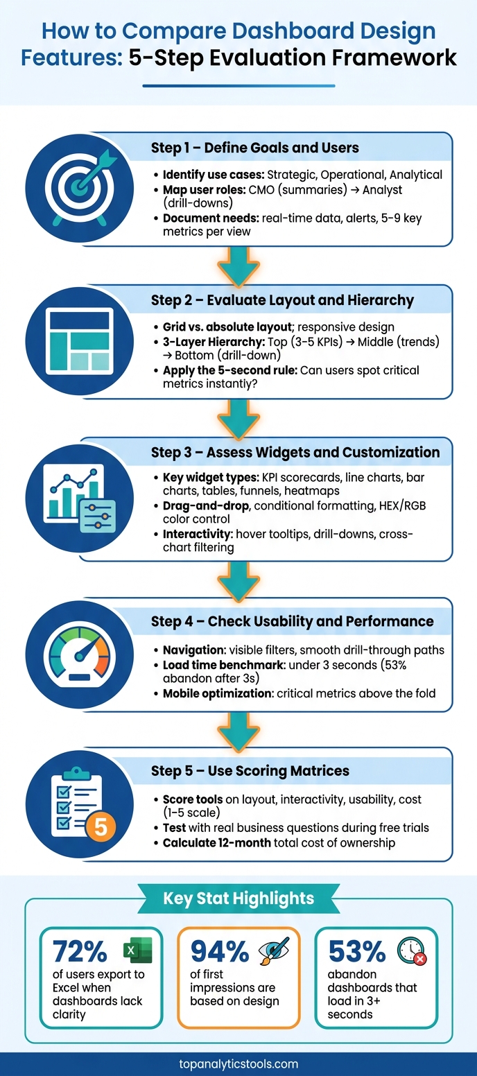
Define Goals and Users:
- Identify use cases (e.g., strategic, operational, or analytical dashboards).
- Understand user roles (e.g., CMOs need summaries; analysts need detailed drill-downs).
- Document functional needs (e.g., real-time data, alerts) and visual priorities (e.g., simplicity, 5–9 key metrics per view).
-
Evaluate Layout and Hierarchy:
- Check layout flexibility (grid vs. absolute) and responsiveness.
- Ensure a clear hierarchy: critical KPIs upfront, trends in the middle, and detailed data last.
- Test usability with the 5-second rule: Can users spot critical metrics instantly?
-
Assess Widgets and Customization:
- Look for key widget types (e.g., KPI scorecards, line charts, tables).
- Prioritize tools with easy customization (e.g., drag-and-drop, conditional formatting).
- Check for interactivity (e.g., hover tooltips, drill-downs, cross-chart filtering).
-
Check Usability and Performance:
- Navigation should be intuitive, with visible filters and smooth drill-through paths.
- Test speed: dashboards should load in under 3 seconds.
- Ensure mobile optimization for on-the-go users.
-
Use Scoring Matrices:
- Compare tools based on layout, interactivity, usability, and cost.
- Test during free trials with real business questions to confirm ease of use.
A well-designed dashboard simplifies decision-making. Use tools like the Marketing Analytics Tools Directory to match your needs and ensure a smooth evaluation process.
How to Compare Dashboard Design Features: 5-Step Evaluation Framework
Designing Effective Interactive Dashboards
Define Your Dashboard Goals and User Requirements
Before diving into dashboard design features, it's crucial to set clear goals. These goals ensure comparisons are meaningful and based on actual needs rather than superficial features.
Identify Dashboard Use Cases
Dashboards serve different purposes depending on their focus. For instance:
- Strategic dashboards track overarching KPIs like ROI or revenue.
- Operational dashboards monitor daily metrics, such as budget pacing or cost per lead (CPL).
- Analytical dashboards allow users to dive deep into data for tasks like anomaly detection or drill-through analysis.
When dashboards are used more like generic reports instead of decision-making tools, a surprising 72% of users end up exporting the data to Excel to find the answers they need.
"If you can't connect a metric to a decision, cut it." - Andrii Romasiun, Swetrix
By defining clear use cases, you can ensure the dashboard aligns with its intended purpose and delivers actionable insights.
Understand User Roles and Needs
Different roles within an organization have unique dashboard requirements. A CMO, for instance, needs high-level summaries and mobile access, while a digital analyst requires detailed data exploration tools. A one-size-fits-all approach rarely works.
Here's a breakdown of common U.S. marketing roles and their dashboard needs:
| Role | Primary Focus | Key Features Needed |
|---|---|---|
| CMO / Executive | High-level KPIs, business health | Summary views, trend lines, mobile access |
| Marketing Manager | Campaign and channel performance | Attribution, alert thresholds, drill-through |
| Digital Analyst | Granular data investigation | Full drill-through, raw data export, anomaly detection |
| Agency Specialist | Multi-client reporting | White-label options, shared dashboards, client layouts |
Understanding these differences helps you design dashboards that cater to specific needs, enhancing their usability and relevance.
Document Functional and Visual Requirements
Once you've identified use cases and user needs, create a detailed checklist to focus on what matters most. This helps you avoid distractions from flashy but unnecessary features.
On the functional side, consider:
- Whether you need real-time data or just historical reporting.
- The level of interactivity required, such as drill-through or cross-filtering.
- Whether users need automated alerts through tools like Slack, email, or Microsoft Teams.
For visual requirements, simplicity is key. Dashboards with more than 12 KPIs experience a 40% drop in user engagement due to cognitive overload. Stick to 5–9 core metrics per view and plan layouts based on how users will access the dashboard. For example, a desktop-focused analyst team will need a very different design compared to a field team relying on mobile devices.
This checklist becomes your guide for evaluating and comparing dashboard tools, ensuring they meet both functional and visual needs effectively.
Analyze Layout Structure and Information Hierarchy
Once you’ve nailed down your dashboard goals and user needs, it’s time to dig into the layout structure and information hierarchy. Why? Because even the most data-packed dashboard won’t succeed if users can’t quickly find what they’re looking for. Here’s a striking stat: 94% of a user's first impression of a digital product is based on its design. And here’s another: between 60% and 80% of dashboards are opened fewer than five times in their lifetime. Often, the culprit is a confusing or cluttered layout.
Evaluate Layout Flexibility and Design Principles
Most dashboards use one of two layout styles: grid layouts, which align widgets to a row-and-column structure with automatic scaling, or absolute layouts, which allow pixel-perfect customization. Whichever you choose, make sure the tool supports responsive designs that work seamlessly on both desktop (e.g., 1366px screens) and mobile devices. Adjustable white space controls are also key for maintaining clarity.
"White space is an element, not the absence of one." - Valiotti Data
A quick test to check your layout’s effectiveness is the 5-second rule: can users identify the most critical KPI in five seconds or less? If not, the layout might be hindering usability.
Assess Information Hierarchy
A solid information hierarchy helps users answer questions like "Are we OK?" without needing to scroll, click, or hover excessively. A common best practice is the three-layer hierarchy:
- Top layer: 3–5 critical KPIs with prominent visuals.
- Middle layer: Contextual trends and patterns.
- Bottom layer: Detailed drill-down data for deeper analysis.
When comparing tools, check if they position key metrics in natural focal areas like the top-left or top-center, especially for left-to-right readers. Eye-tracking studies reveal that users spend 60% of their first 8 seconds focusing on the largest tile on a page. This makes the placement and size of elements more than just aesthetic - they’re functional decisions.
"If a user has to scroll to find out whether things are OK, the pyramid is broken." - IGC
Grouping is another factor to consider. Titled sections allow users to locate information about three times faster than untitled clusters of widgets. Look for tools that offer features like containers or cards to group related metrics effectively. Clear headers and ample white space can make a world of difference.
Build a Layout Comparison Matrix
After evaluating different tools, organize your findings in a comparison matrix. This helps you objectively compare layout features across tools. Here’s an example:
| Dimension | Tool A | Tool B | Tool C |
|---|---|---|---|
| Layout type (grid / absolute / both) | |||
| Responsive scaling (auto / manual) | |||
| Top-left KPI placement (yes / no) | |||
| White space control (px-level / preset) | |||
| Section grouping (cards / headers / none) | |||
| 5-second KPI test (pass / fail) | |||
| Three-layer hierarchy support (full / partial / none) |
Use a simple scoring system (e.g., 1–3 scale or pass/fail) to rate each tool on the dimensions most relevant to your needs. For instance, an executive dashboard might prioritize Layer 1 KPIs, while an analyst-focused tool may need robust Layer 3 drill-down capabilities. Tailor the matrix to your specific use case for the clearest results.
Compare Widget Options and Customization Features
Once your layout comparison matrix is in place, the next step is diving into the widgets each tool offers. Widgets are the foundation of any dashboard - they shape how data is displayed, interpreted, and interacted with.
Identify Key Widget Types
Widgets come in a variety of forms, each serving a specific purpose. For instance:
- KPI scorecards: Ideal for giving executives a snapshot of critical metrics like Revenue, ROAS, or CPA.
- Line charts: Perfect for visualizing trends over time.
- Bar charts: Simplify comparisons, such as analyzing performance across platforms like Google Ads and Meta.
- Table widgets: Essential for detailed, row-level data, such as campaign performance audits.
- Funnel widgets: Help map out conversion paths.
- Heatmaps: Useful for visualizing geographic data or engagement density.
When designing dashboards, aim to focus on 5–9 key metrics. This ensures clarity and avoids overwhelming users. Every widget should contribute to actionable insights and support efficient decision-making.
Next, it’s crucial to evaluate how easily these widgets can be tailored to meet your reporting needs.
Assess Customization Capabilities
A widget library’s value lies in its adaptability. Look for tools that offer features like drag-and-drop resizing with grid snapping, precise color customization (via HEX or RGB), and conditional formatting (e.g., marking a CPA widget red if it surpasses a target threshold).
It’s also important that widget formats align with U.S. standards, such as displaying currency as $1,234.56 and dates in the MM/DD/YYYY format. This eliminates the need for manual adjustments and ensures reports are immediately usable across teams. Additionally, check the number of native data connectors the tool supports. Top-tier solutions often provide 15 or more connectors, with automatic syncing to reduce manual data import efforts.
"I used to spend 20 minutes every Monday morning building the same GA4 exploration... With ObserviX, I built my dashboard once - revenue by channel, ROAS by campaign, landing page performance side by side." - James Rivera, Head of Growth, SaaS Platform
Once you’ve confirmed the tool’s visual and functional customization options, it’s time to assess how interactive the widgets are.
Evaluate Widget Interactivity
While static widgets display data, interactive widgets allow users to explore it. Key interactive features to look for include:
- Hover tooltips: Enable users to see precise values without cluttering the visuals.
- Drill-down capabilities: Allow users to expand data, such as breaking monthly totals into weekly figures within the same widget.
- Cross-chart filtering: Clicking a data point in one widget updates all related visualizations on the dashboard.
Interactive dashboards should also ensure users can navigate easily, avoiding confusion when exploring drill-down layers. Additionally, confirm that interactivity remains intact when dashboards are shared via links, rather than being converted into static images. As one expert insight highlights:
"Every static report creates another follow-up question." - Qrvey
sbb-itb-5174ba0
Review Usability, Navigation, and Performance
Once you've nailed widget interactivity, the next step is making sure users can easily find what they need. Even the most visually stunning dashboard won't cut it if navigation feels clunky or if the page drags while loading.
Assess Navigation and Discoverability
The 5-second rule is key here - users should see critical metrics instantly. Research shows decision-makers spend just 2.3 seconds scanning a dashboard before deciding whether to engage or move on.
"A dashboard is not a museum of metrics. It is a tool that helps someone make decisions quickly and confidently." - Del Bueno Studio
Clear navigation is essential. For example, active filters should always be visible - preferably as "chips" or "pills" - so users know exactly what data they're viewing. When testing tools, check every drill-through path to ensure users can navigate back without needing to refresh the page.
Evaluate User-Friendliness and Learnability
Once navigation feels intuitive, shift focus to how easily new users can understand the dashboard. Most people stick to default settings, so the out-of-the-box experience plays a huge role. Are the default metrics helpful, or just placeholders that need immediate customization?
A quick test: show the dashboard to someone unfamiliar with it for five seconds. Then ask them to identify the most important metric. If they can't, the visual hierarchy needs improvement. Consistent color coding also matters - red should signal risks or declines, green should indicate growth, and so on. This avoids forcing users to relearn meanings for every widget.
Here’s an example: in 2026, a UK-based banking analytics platform revamped its dashboard by removing 17 low-value metrics and focusing on just four key ones that accounted for 80% of user sessions. The result? A 41% increase in adoption over six weeks.
Once usability is on point, it's time to focus on technical performance. After all, a great dashboard isn't just easy to use - it also needs to deliver insights in real time.
Test Dashboard Performance
Performance can make or break a dashboard. 53% of users will abandon a dashboard if it takes longer than 3 seconds to load. To assess performance, focus on three critical metrics:
| Metric | 2026 Benchmark Goal | Impact of Failure |
|---|---|---|
| Largest Contentful Paint (LCP) | Under 2.5 seconds | High abandonment after 3 seconds |
| First Input Delay (FID) | Under 100ms | Feels laggy to users |
| Time-to-First-Insight | Under 10 seconds | Delays in decision-making |
Mobile performance is just as crucial. On average, mobile dashboard sessions last around 47 seconds. This means critical alerts and key metrics must be immediately visible - don’t bury them below the fold. Tools designed with dedicated mobile views (instead of squashing the desktop layout onto a smaller screen) tend to perform better.
"Speed is a UX feature. Performance is not an engineering problem to solve after the design is done; it's a constraint that shapes the design from the first sketch." - Sanjay Dey, UX Designer
Use the Marketing Analytics Tools Directory to Compare Tools
The Marketing Analytics Tools Directory is a great resource to help you find analytics platforms that match your specific benchmarks. It connects your design criteria with a curated selection of marketing analytics tools.
Browse Relevant Tool Categories
The directory organizes tools based on their primary use cases - such as reporting, campaign tracking, or business intelligence. This makes it easy to zero in on platforms that meet your team's specific needs. Whether you're looking for advanced, customizable solutions or quicker, no-code options, there's something for every type of user. Some tools can even be operational within hours.
Filter and Review Listings
Once you've identified your benchmarks, use the directory's filters to refine your search based on factors like usability and feature depth. For instance, tools such as Databox and Looker Studio are noted for their low setup difficulty, while Tableau and Looker require more effort to implement.
Expert reviews provide additional insights into ease of use and functionality. For example, Amplitude boasts an ease-of-use rating of 9.2/10 and excels in behavioral analytics. On the other hand, Plausible scores slightly higher at 9.5/10 for ease of use, though it prioritizes privacy over customization.
"The best analytics tool is not the one with the most features. It is the one your team will actually trust, maintain, and use every week." - Jordan Ellis, Senior SEO Content Strategist
Map Tools to Your Comparison Worksheets
After narrowing down your options, align the shortlisted tools with your performance criteria. Use comparison worksheets to score each tool (on a scale of 1–5) based on factors like use-case fit, integration capabilities, and ease of use for analysts. Assign weighted scores to reflect your team's priorities.
During free trials, put the tools to the test by tackling a real business question, such as "What was our ROAS by channel last quarter?" If a team member can't answer this without contacting the data team, that's a warning sign. No feature set can compensate for poor usability in such cases.
As of 2026, 27 of the 30 top-rated tools in the directory offer free plans. This means you can thoroughly test your options before committing to a platform, giving you confidence in your final choice.
Conclusion: Key Steps for Comparing Dashboard Design Features
After diving into layout options, widget interactivity, and overall user experience, it's time to wrap up your evaluation process. The goal? Choose a dashboard tool that truly supports faster, smarter decision-making. As David Pombar of Trackingplan aptly says:
"Dashboards are decision systems, not data displays."
Start by mapping out the key decisions users need to make and documenting role-specific requirements. Then, evaluate features like layout flexibility, information hierarchy, widget customization, and interactivity to see how well they align with those needs.
To keep the process objective, use a scoring matrix. Rate each tool based on criteria such as integration capabilities, usability, and governance, assigning weights according to your business priorities (e.g., 30% for integration, 20% for scalability). This approach reduces subjective bias and gives leadership a clear, data-backed justification for the final decision. Once you’ve rated the tools, don’t forget to factor in the financial side of things.
Calculate the total cost of ownership over a 12-month period, accounting for implementation, training, and any potential overage fees. After launch, conduct a usage audit within 60 days to identify underused features. Removing these will help ensure the dashboard remains focused and effective.
For additional support, the Marketing Analytics Tools Directory is a handy resource. Use it to revisit your shortlist, discover new tools, and ensure your chosen platform continues to meet your evolving needs.
"A dashboard is not complete when every metric is visible. It is complete when the right person can make the right decision faster than before." - Daniel Mercer, Senior SEO Content Strategist, Analyses.info
FAQs
Which dashboard type do I need?
The type of dashboard you choose should align with your objectives and the audience you're addressing. Strategic dashboards are designed for executives, offering a high-level view of long-term trends. Operational dashboards focus on real-time data, making them perfect for managing daily activities. Tactical dashboards, on the other hand, delve into historical data to assist with planning and decision-making. If your needs are more specialized, you might explore campaign-specific dashboards or event monitors. To find the right tools for these varied reporting purposes, check out the Marketing Analytics Tools Directory.
What should I test in a free trial?
During your free trial, don't just scratch the surface - dive deeper to truly evaluate the tool. Set up at least one real integration, such as web tagging, API connections, or CRM links. Then, create and execute three actual workflows on a schedule, like on day 2, day 7, and day 12.
Pay close attention to key factors: assess the quality of the data, ensure the platform is user-friendly for both technical and non-technical users, and evaluate how well it handles workflows. Don't forget to test its error-handling capabilities and see if it allows you to replay failed data jobs when issues crop up. This thorough approach ensures you get a clear picture of how the tool performs in real-world scenarios.
How do I score dashboard tools fairly?
When evaluating dashboard tools, it’s important to focus on what truly matters for long-term success and accuracy. Consider these key factors:
- Team Skill Compatibility: Does the tool match your team's technical abilities? For instance, does it support no-code interfaces for non-technical users, or does it require SQL expertise?
- Data Governance: Look for features like semantic layers and robust security measures to ensure data integrity and compliance.
- Connectivity and Performance: Prioritize tools that handle live queries effectively and can scale as your data grows.
- Maintainability: Check how easy it is to manage updates, handle API limitations, and ensure the tool stays functional over time.
- Decision-Driven Design: Opt for dashboards that offer clear, interactive visualizations to support informed decision-making.
Skip the temptation to rely on superficial checklists. Instead, focus on tools that genuinely align with your team's unique needs and objectives.