KPI visualization simplifies complex data into visual dashboards, helping businesses make faster, smarter decisions. With 230% more data compared to 2020, static spreadsheets are no longer enough. Visual dashboards provide a real-time, clear view of business performance, enabling teams to spot trends, address issues, and align goals effectively.
How to Create a KPI Dashboard? | 4 Common Methods
Key Takeaways:
- What are KPIs?: Key Performance Indicators measure progress toward specific business objectives, such as financial health, customer satisfaction, or marketing success.
- Why Visualize KPIs?: Visuals make data easier to understand and highlight patterns or outliers faster than raw numbers.
- Best Practices: Limit dashboards to 5–9 metrics, use clear chart types (e.g., bar, line, scatter), and ensure context (e.g., benchmarks, comparisons).
- Top Tools (2026): Platforms like Tableau, Databox, and Klipfolio offer tailored solutions for real-time, automated KPI tracking.
Focus on KPIs that drive action. A well-designed dashboard tells a story in seconds, helping teams prioritize decisions and stay ahead. Dive into the full guide for practical steps and tools to streamline your data visualization process.
Important KPIs for Marketing and Business Dashboards
When building dashboards, it’s crucial to focus on KPIs that directly tie into your strategic goals. A good rule of thumb is the "Rule of Nine" - limit your dashboard to tracking 5–9 essential metrics.
"Overloaded dashboards often look impressive but rarely get used." - Ivan Vislavskiy, CEO, Comrade Digital Marketing Agency
To make the most of your KPIs, align them with the customer journey: Awareness (top of the funnel), Engagement (middle), Conversion (bottom), and Retention (post-sale). Keep in mind that different industries have their own priorities. For example, SaaS companies often monitor Monthly Recurring Revenue and Churn Rate, eCommerce businesses focus on Average Order Value and Cart Abandonment, and B2B companies emphasize Lead Quality and Pipeline Velocity. These tailored KPIs help create dashboards that are both clear and actionable.
Core Marketing KPIs
Here are some of the most commonly tracked marketing KPIs, along with what they reveal:
- Conversion Rate: This measures the percentage of visitors who take a desired action, such as making a purchase or signing up. Use the formula: (Conversions ÷ Total Visitors) × 100. For ads, click-through rates of 1.5–3% for search and 0.5–1% for display are considered solid.
- Customer Acquisition Cost (CAC): This shows how much you’re spending to acquire each new customer. Calculate it by dividing total marketing costs by the number of new customers. A good rule of thumb is to aim for a Customer Lifetime Value (CLV) that’s at least three times your CAC.
- Return on Ad Spend (ROAS): This metric reveals how profitable your ad campaigns are. It’s calculated by dividing revenue from ads by total ad spend. A ROAS between 2.5x and 4x is generally a good target.
- Engagement Rate: This tracks how much your audience interacts with your content. On social media, engagement rates typically range from 1% to 5%, depending on the industry. With over 5 billion social media users globally in 2024, understanding engagement is critical to standing out.
- Churn Rate: This measures how many customers you lose over a given period. Calculate it as (Customers Lost ÷ Total Customers at Start) × 100. For SaaS companies, a monthly churn rate below 5% is considered healthy.
Here’s a quick breakdown of KPIs across the customer journey:
| Funnel Stage | Campaign Goal | Critical KPIs |
|---|---|---|
| TOFU | Brand Awareness | Impressions, Reach, Branded Search Volume, CTR |
| MOFU | Engagement | Time on Site, Bounce Rate, Email Open Rate |
| BOFU | Conversion | CAC, ROAS, Conversion Rate, MQL to SQL Rate |
| Retention | Customer Loyalty | Churn Rate, Repeat Purchase Rate, NPS, CLV |
While marketing KPIs help optimize campaigns, business KPIs provide a broader perspective on financial health and overall growth.
Business Performance KPIs
Here are some of the key KPIs that track a business’s financial and operational performance:
- Net Profit Margin: This measures profitability by dividing net income by revenue and multiplying by 100. It shows whether your pricing and cost structure are supporting your profit goals.
- Revenue Growth Rate: This tracks how fast your business is growing. Calculate it by comparing the current period’s revenue to the previous period: [(Current Revenue - Previous Revenue) ÷ Previous Revenue] × 100. It’s a great indicator of market traction and scalability.
- Customer Lifetime Value (CLV): This estimates the total revenue a customer will bring over their lifetime. Use the formula: Average Purchase Value × Purchase Frequency × Average Customer Lifespan. CLV helps you determine how much you can spend on acquiring customers while staying profitable.
"A higher CLTV signifies a more valuable and profitable customer, guiding you toward strategies that prioritize long-term customer satisfaction and customer loyalty." - Katie Dunn, Sr. Manager, Demand Generation at ThoughtSpot
- Net Promoter Score (NPS): This measures customer satisfaction and loyalty. According to Bain & Co, scores above 20 are "favorable", above 50 are "excellent", and above 80 are "world-class". High NPS scores often predict future growth, as happy customers are more likely to promote your brand.
The key is to focus on metrics that prompt immediate action when they fall short.
Best Practices for KPI Visualization
KPI Visualization Chart Types and Use Cases Guide
Once you've nailed down the key metrics to track, the next step is figuring out how to present them effectively. A well-designed dashboard should communicate insights instantly, helping decision-makers take action without hesitation. As Ben Shneiderman, Distinguished University Professor Emeritus at the University of Maryland, wisely put it: "The purpose of visualization is insight, not pictures". In other words, your dashboard should tell a clear, concise story that anyone can understand in seconds.
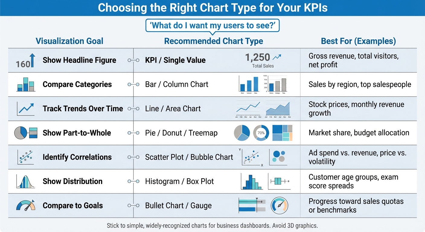
Choosing the Right Chart Type for Each KPI
The best way to pick a chart is to start with this question: "What do I want my users to see?". The answer determines the type of visualization you need. For example:
- Tracking revenue growth over time? A line chart fits the bill.
- Comparing sales across regions? Use a bar chart.
- Measuring progress toward a quarterly goal? Try a bullet chart or gauge.
Stick to simple, widely-recognized charts like bar, line, and scatter plots for business dashboards. Avoid flashy 3D graphics - they take up unnecessary space and make it harder to interpret values accurately.
Here’s a quick guide to match your goals with the right chart type:
| Visualization Goal | Recommended Chart Type | Best For... |
|---|---|---|
| Show Headline Figure | KPI / Single Value | Gross revenue, total visitors, net profit |
| Compare Categories | Bar / Column Chart | Sales by region, top salespeople |
| Track Trends Over Time | Line / Area Chart | Stock prices, monthly revenue growth |
| Show Part-to-Whole | Pie / Donut / Treemap | Market share, budget allocation |
| Identify Correlations | Scatter Plot / Bubble Chart | Ad spend vs. revenue, price vs. volatility |
| Show Distribution | Histogram / Box Plot | Customer age groups, exam score spreads |
| Compare to Goals | Bullet Chart / Gauge | Progress toward sales quotas or benchmarks |
A Tableau case study highlights how Rakesh Rallapalli, Practice Lead for Business Analytics at CRIF High Mark Information Services, used Tableau to create complex heat maps in under a day - cutting what used to take 40 worker hours by 80%.
Designing Clear Dashboards
To make your dashboard intuitive, place the most critical KPIs in the top-left corner - this is where users naturally focus first. Follow the "Rule of 6", limiting each section to no more than six visualizations to avoid overwhelming users.
Consistency is key. Use the same color scheme throughout, and add extra indicators like arrows or icons to make data easier to interpret. Always provide context - show KPIs alongside benchmarks, date ranges, or comparisons to previous periods. A KPI without context can lead to misinterpretation in up to 84% of cases.
Group related metrics together with white space to create logical sections. And don’t forget to make your dashboard mobile-friendly so it works seamlessly on phones and tablets.
Matillion saved over $75,000 annually by using ThoughtSpot's search-driven analytics, which reduced manual report requests by 80%.
Deutsche Bank revamped its ESG reporting by swapping dense PDFs for Power BI dashboards. The update included small multiples and color-coded KPIs, boosting the trustworthiness rating among board members from 54% to 89%.
Avoiding Common Visualization Mistakes
Overcrowding is one of the biggest pitfalls. Dashboards with more than 5–9 visualizations confuse users and dilute the story you're trying to tell. Use the "5-Second Rule": your audience should grasp the overall performance picture within five seconds.
Another common error? Choosing the wrong chart type. For example, pie charts often fail to provide clear comparisons - bar charts are a better option for that. And always start bar charts at zero on the Y-axis to avoid exaggerating differences. If your category labels are too long and appear diagonally, switch to horizontal bar charts for easier readability.
Lastly, keep your color palette simple. Use neutral grays for baseline data, reserving bold, high-contrast colors for highlighting key differences or exceptions.
sbb-itb-5174ba0
Top Tools for KPI Visualization in 2026
Overview of Leading Tools
The landscape of KPI visualization tools in 2026 ranges from budget-friendly options to sophisticated platforms powered by AI. Here's a quick look at some of the standout tools:
- SimpleKPI: Starting at just $14 per month, SimpleKPI offers over 40 chart types and a straightforward flat-rate pricing model, making it accessible for small teams and departments.
- Klipfolio: With 130+ native integrations and its "PowerMetrics" feature for centralized metric management, Klipfolio is a solid choice for agencies. Professional plans start at around $60 per month.
- Geckoboard: Ideal for real-time office dashboards, Geckoboard supports 90+ integrations and auto-refresh capabilities. Plans begin at ~$49/month (when billed annually).
- Databox: Known for its mobile-first approach, Databox includes AI-driven alerts, goal tracking, and 200+ pre-built templates. Its Professional tier starts at ~$159 per month. One agency reported saving 63 hours monthly with this tool.
- Tableau: Tableau continues to lead in enterprise data visualization. Its 2026 feature, "Einstein Copilot", allows users to create visualizations via natural language. Creator plans are priced at ~$75/user/month.
"We now rely fully on Improvado for multiple dashboards that we use for day-to-day marketing operations and strategy, as well as for presentations to executive leadership."
- Waleed Noury, Lead Analytics Engineer at Activision
- Whatagraph: Designed for marketing teams, Whatagraph uses its AI, "Whatagraph IQ", to automatically generate dashboard layouts from plain language inputs. Agencies have reported saving over 100 hours monthly thanks to automation. Pricing starts at ~$229 per month.
- Sisense: This tool specializes in embedded analytics, offering white-label dashboards with custom pricing for SaaS products.
- Plecto: Perfect for sales and support teams, Plecto gamifies performance tracking with features like leaderboards and badges. Plans start at ~$230/month.
For a deeper dive into these tools, check out the Marketing Analytics Tools Directory.
Using the Marketing Analytics Tools Directory
Choosing the right KPI visualization tool can be a daunting task with so many options available. The Marketing Analytics Tools Directory (https://topanalyticstools.com) simplifies this process by categorizing tools based on functionality, helping you find the best fit for your needs. Whether you're looking for self-service platforms, visualization-focused solutions, or dashboard-as-code tools, the directory has you covered.
You can filter tools by integration compatibility, such as Salesforce, HubSpot, Google Analytics, or SQL databases. It also allows comparisons based on workflow requirements, like drag-and-drop features for non-technical users or Git integration for engineering teams. Additionally, side-by-side comparisons of features like AI-driven insights, automated reporting, mobile scorecards, and real-time updates make it easier to pinpoint the ideal tool for your business.
Tool Comparison Table
Here's a quick comparison of the top KPI visualization tools to help you decide:
| Tool | Best For | Key Strength | Starting Price | Chart Options |
|---|---|---|---|---|
| SimpleKPI | SMEs & Departments | Flat-rate pricing with 40+ KPI charts | $14/month | 40+ KPI charts |
| Geckoboard | Live Office Displays | TV-optimized layouts for team huddles | ~$49/month | Pre-built widgets |
| Klipfolio | Agencies & Marketing | 130+ integrations and branded dashboards | ~$60/month | Highly customizable |
| Databox | Mobile Users | Mobile-first scorecards with AI tracking | ~$159/month | 200+ templates |
| Whatagraph | Marketing Teams | AI-powered layouts and insights | ~$229/month | Marketing-focused |
| Tableau | Enterprise/Data Teams | Advanced storytelling with AI features | ~$75/user/month | Advanced/Interactive |
| Plecto | Sales Teams | Gamification with leaderboards and badges | ~$230/month | Real-time motivation |
| Sisense | Embedded Analytics | White-label dashboards for SaaS products | Custom pricing | Enterprise-grade |
This table offers a snapshot of each tool's strengths, pricing, and charting capabilities, making it easier for you to identify the right fit for your KPI visualization needs.
Step-by-Step Guide to Building a KPI Dashboard
Step 1: Define Your KPIs
Start by identifying who will use the dashboard and what decisions it needs to support. For instance, a social media manager will focus on different metrics than a CMO. Trying to cram everything into one dashboard only creates clutter. As Emily Hayward from Klipfolio puts it:
"A KPI dashboard is a communication medium - understand its users, and its purpose becomes clear".
Separate your KPIs from regular metrics. Metrics track general business activities, but KPIs zero in on the critical areas tied directly to strategic goals. For example, "website visits" is a metric, but "conversion rate from visit to demo request" becomes a KPI if demo requests directly influence revenue.
Collaborate with stakeholders to figure out which metrics actually drive decisions. Start with a broad list, then narrow it down to elements that directly support action. Each KPI should include three parts: the current value (base measure), the goal (target measure), and a threshold (an indicator that flags when action is needed).
Organize your KPIs to tell a logical story. For a sales dashboard, this might look like tracking leads generated, moving to qualified leads, then conversion rates, and finally paying customers.
"When it comes to dashboard design, one-size-fits-nobody" - Emily Hayward, Klipfolio
Once you’ve nailed down your KPIs, the next step is to connect the data that powers them.
Step 2: Connect Data Sources
Manually updating dashboards with tools like Excel or PowerPoint can lead to errors. Automating data retrieval ensures real-time accuracy. Modern dashboards can pull data automatically using native connectors, SQL queries, or APIs from platforms like Google Analytics, CRMs, and more.
Before you dive in, identify the exact data points needed for your KPIs. For example, calculating a conversion rate might involve pulling visitor data from Google Analytics and lead data from your CRM. If your metrics require combining multiple data sources or complex calculations, using a data warehouse like BigQuery or Snowflake can help maintain smooth performance.
During this process, make sure to clean your data - remove duplicates, address missing values, and include timestamps. Adjust refresh rates based on how often your audience needs updates.
Once the data is connected, you can shift your focus to designing a dashboard that’s both functional and visually clear.
Step 3: Design and Optimize Your Dashboard
Apply the "5-second rule" by placing your most important KPI in the upper-left corner, where users can immediately grasp the key message. Keep the total number of items manageable - five to seven is a good range.
Always provide context for your data. Include comparison points like targets, previous periods (e.g., month-over-month), or trailing averages. Pre-calculate metrics like percentage changes so users don’t have to figure it out themselves.
Use neutral colors for general data and save bold colors - like red for warnings or green for growth - for elements that require immediate attention. Skip flashy visuals like 3D charts or gradients, as these can distract from the actual data.
If your dashboard will be displayed on a TV, simplify the design by removing axis labels and trimming excess content for better readability from a distance. For mobile dashboards, use filters and menus to make complex datasets more digestible.
Finally, test your dashboard with real users and refine it based on their feedback. Keep in mind that bar graphs work best when limited to 10 data points, while pie charts should have no more than six segments to remain clear.
Conclusion
Turning raw data into meaningful insights starts with effective KPI visualization. By tapping into the brain's ability to process visuals quickly, teams can move faster - shifting from merely spotting trends to understanding their implications. Simplifying complex datasets into clear, visual patterns reduces mental strain and highlights the metrics that truly drive outcomes.
The secret? Focus on metrics that lead to action, not just flashy numbers. Every KPI on your dashboard should answer this: "If this number changes, what will we do about it?". Stuart Kinsey, Co-founder of SimpleKPI, emphasizes this point:
"Embracing KPIs and visualizing performance is essential for any organization to thrive and grow".
This approach works. According to the KPI Institute, 68% of businesses saw improved performance after introducing a KPI strategy.
And here’s the reality: in 2026, marketers will deal with 230% more data than they did in 2020. Relying on manual updates won’t cut it anymore. Modern platforms, equipped with over 500 pre-built data connectors, eliminate spreadsheet errors and streamline workflows. Automation isn’t optional - it’s a must.
Want to make this shift? Start by exploring tools designed for real-time, automated KPI visualization. Check out the Marketing Analytics Tools Directory at https://topanalyticstools.com to compare solutions for enterprise intelligence, campaign tracking, or automated reporting. It’s a straightforward way to find tools tailored to your needs - whether it’s features, budget, or technical complexity.
Begin small. Create one dashboard that answers your most pressing business question. Test it, improve it, and expand from there. As Jennifer Aaker from Stanford Graduate School of Business wisely points out:
"Stories are remembered up to 22 times more than facts alone".
Your KPI dashboard is more than just numbers - it’s the story that keeps your team focused and ready to act.
FAQs
What should I consider when choosing a KPI visualization tool for my business?
When choosing a KPI visualization tool, the first step is to define your goals and pinpoint the key metrics you need to monitor. Think about the story you want your data to tell and ensure the tool can deliver clear, meaningful visuals that align with your business priorities.
Next, take a closer look at the tool's features. Prioritize tools that offer dynamic dashboards, a variety of chart options, and interactive elements. Seamless integration with your existing data sources is crucial, too. Don't overlook user-friendliness, scalability, and collaboration tools like role-based access, which make it easier for teams to work together effectively.
Lastly, weigh the practical considerations, such as cost and the tool's ability to grow with your business. Opt for a solution that fits within your budget but also provides the flexibility to meet your changing data needs, empowering you to make informed, data-driven decisions.
What are the best chart types for visualizing different KPI goals?
The ideal chart type for visualizing KPIs depends on the type of data and the insights you aim to emphasize. For instance, bar charts work well when comparing performance across different categories or time periods. If you're tracking trends or progress over time, line graphs are your go-to option. Want to explore relationships between variables? Scatter plots are perfect for spotting correlations. And when it comes to analyzing distributions or multi-dimensional data, heat maps and histograms are highly effective.
The key is to align your chart choice with the question you're addressing. For comparing performance metrics, bar charts are straightforward and impactful. If your focus is on trends, a line graph makes those patterns easy to follow. When relationships or patterns take center stage, scatter plots or heat maps can provide clarity. The ultimate goal is to present your KPIs in a way that's clear, actionable, and directly tied to your objectives.
How can I create a KPI dashboard that is both actionable and visually effective?
To build a KPI dashboard that works well and looks good, focus on clarity, relevance, and usability. Start by clearly identifying the dashboard's main purpose and choosing KPIs that directly support your business objectives. Arrange the data in a logical way, using techniques like larger fonts for critical metrics and intuitive color coding to naturally draw attention to the most important information.
Add interactive features like filters or drill-down options so users can explore details without feeling overwhelmed. Make it a priority to gather feedback from users and test the dashboard regularly to ensure it meets both functional and business expectations. A strong dashboard balances visual design with actionable insights, serving as a valuable tool for better decision-making.