Most marketing dashboards fail for one simple reason: they show numbers, but not the next decision. If I want reports people will use, I need to keep each view tied to one question, limit each page to 5–7 KPIs, match the chart to the task, and add context like targets, prior-period comparisons, and event notes.
Here’s the short version:
- I start with the goal and audience
- I pick the right chart for the question
- I use color, labels, and dates the same way every time
- I keep time ranges and metric definitions aligned
- I cut clutter and separate dashboards, reports, and tables
- I make charts easy to read on screens, phones, and projectors
- I use tools that use real-time marketing analytics tools to keep data current and definitions aligned
A few stats from the article show why this matters:
- Only 31% of marketing leaders say they use the dashboards built for them
- 67% of users lose confidence when dashboards show stale data
- 34% of marketers say dashboards are too cluttered
- 72% of professionals still export data by hand to find answers
Quick comparison
| Practice area | What I focus on | Common mistake |
|---|---|---|
| Goal and audience | One question per visual | Showing data with no decision tied to it |
| Chart choice | Trend, comparison, funnel, mix, or correlation | Using the wrong chart for the job |
| Labels and context | Clear titles, targets, annotations | Forcing readers to guess what changed |
| Time and formatting | Same date range, U.S. dates, $ formatting | Mixing windows, labels, and number styles |
| Layout | Clean dashboard, separate detail views | Packing everything into one screen |
If I do these 12 things well, my reporting gets easier to scan, easier to trust, and easier to act on.
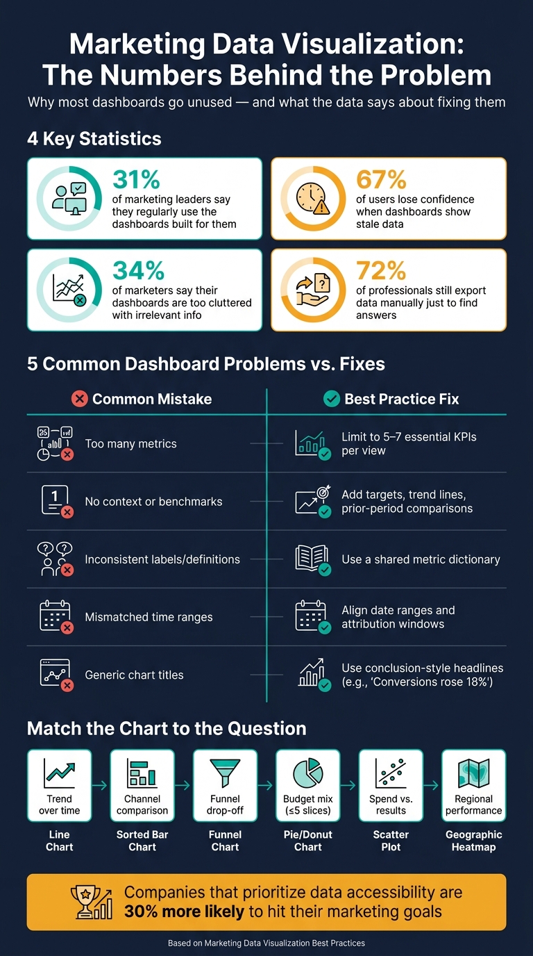
Marketing Dashboard Failures: Key Stats & Best Practices at a Glance
5 Tips to Improve Your Digital Marketing Dashboards (from a Data Visualization Expert!)
sbb-itb-5174ba0
Why Marketing Teams Need Better Visualization Standards
Most marketing dashboards miss the mark for a simple reason: they show data without pointing to a decision. That’s a big deal. Only 31% of marketing leaders say they regularly use the dashboards their analytics teams build. The problem usually isn’t the data itself. It’s how that data gets shown.
The usual issues show up again and again: using top analytics tools for business to track too many metrics, labels that change from one report to the next, date ranges that don’t match, and charts that bury the main point. Once a dashboard gets stuffed with 30+ KPIs, people stop using it. And when a term like "conversion" means one thing in one report and something else in another, trust falls apart fast. You end up with reports people stop trusting because they are too confusing or take too long to understand.
Missing context makes the mess even worse. If two charts in the same report use different date windows or attribution logic, people can walk away with two different readings of the same situation. That slows down meetings, follow-up, and decisions.
Shared standards help fix this. They help executives get to an answer fast, let managers compare results without second-guessing the numbers, and save analysts from doing the same cleanup work over and over. Companies that put data accessibility and actionability first are 30% more likely to hit their marketing goals.
| Common Problem | Impact | Fix |
|---|---|---|
| Too many metrics | Decision-makers stop using it | Limit to 5–7 essential KPIs per view |
| No context or benchmarks | Numbers are impossible to evaluate | Add targets, trend lines, or prior-period comparisons |
| Inconsistent labels/definitions | Creates confusion and distrust | Use a shared metric dictionary across all reports |
| Mismatched time ranges | Leads to conflicting data interpretations | Align date ranges and attribution windows throughout |
| Generic chart titles | Hides the key takeaway | Use conclusion-style headlines (e.g., "Conversions rose 18%") |
The next sections turn these common breakdowns into clear design rules, starting with goal and audience. Define the question first, then choose the chart.
1. Define Your Marketing Goal and Audience First
Start with the goal.
Before you choose a chart or pull even one metric, ask: what decision should this visual help someone make? That one answer shapes the metric, the comparison, and how often the data should update. Without that, it’s easy to build charts that look polished but don’t help anyone do their job.
Each chart should answer one business question. If it doesn’t help someone make a decision, cut it.
Your audience matters just as much. Different people need different levels of detail.
- Executives need outcomes in plain English: revenue, CAC, and ROAS.
- Channel managers need things like CPA by channel and path to conversion.
- Analysts need the deeper layer: ad-level results, keyword data, and raw exports.
A simple way to get this right is to talk to the people who’ll use the report before you build it. Ask what decisions they make each week or month. Ask what data they still have to request by hand. That usually shows you what belongs in the dashboard and what doesn’t.
Then keep each view tight: 5–7 KPIs that directly support those decisions. More than that spreads attention too thin.
Use the table below as a quick match between business goal, audience, KPI set, and visual type for dashboards, reports, and campaign reviews.
| Marketing Goal | Key Audience | Essential KPIs | Recommended Visual |
|---|---|---|---|
| Lead generation | Demand gen managers | Conversion rate, Cost per MQL | Funnel chart for stage drop-off; line chart for lead trends |
| Revenue growth | Executives, CFOs | Total revenue, Blended CAC, ROAS | Revenue-over-time line chart; stacked bar for channel contribution |
| Campaign optimization | Channel managers | CTR, CPA by channel | Grouped bar charts for comparison; scatter plots for spend vs. conversions |
| Brand awareness | CMOs, brand teams | Share of Voice, Brand Search Volume | Area charts for volume trends; heatmaps for geographic engagement |
Once the goal and audience are clear, the chart choice gets a lot easier. You’re no longer asking, “What looks good?” You’re asking, “What answers the question fastest?”
2. Match the Chart Type to the Marketing Question
Once the goal and audience are clear and you have selected your top marketing analytics tools, the next call is the chart itself. Pick the chart that answers the question fastest.
Different charts do different jobs. Line charts show trends over time. Bar charts show comparisons. Funnel charts show drop-off between stages. Scatter plots show the relationship between two metrics. If you use a bar chart for weekly traffic, for example, the ups and downs can look sharper than they are. A line chart handles that kind of view better.
Pie charts work best for simple part-to-whole views with five or fewer slices. If you have more categories than that, use a sorted horizontal bar chart instead. Stacked charts are useful when you want to show composition over time. But if the main goal is to see which channel moved the most, separate lines are easier to read.
Here’s a simple way to match the question to the chart:
| Marketing Question | Recommended Chart | Common Mistake to Avoid |
|---|---|---|
| How is revenue trending this quarter? | Line Chart | Using a bar chart, which can exaggerate volatility |
| Which channel generated the most leads? | Sorted Bar Chart | Sorting alphabetically instead of by performance |
| Where are leads stalling in the funnel? | Funnel Chart | Using it for non-sequential stages |
| What is our current channel budget mix? | Stacked Bar or Pie Chart (five or fewer slices) | Including too many categories |
| Does higher ad spend correlate with LTV? | Scatter Plot | Overinterpreting correlation as causation |
| Which audience segments underperform? | Heat Map | Relying on a table instead of surfacing patterns visually |
If people need the exact campaign numbers, add a table right below the chart.
3. Use Color with Purpose and Accessibility in Mind
Once you’ve picked the right chart, use color to steer attention, not just make the page look nice.
Start with a tight palette: one primary brand color, one accent color, neutral grays for background data, and one alert color for exceptions. Then save bright color for the one metric or campaign that needs attention most.
Keep those color meanings the same across every chart in the report. If blue means one thing in one chart and something else in the next, readers have to stop and reset. That friction slows decisions.
Color should work like a rule, not like decoration. About 1 in 12 men and 1 in 200 women have some form of color vision deficiency. So color can’t be your only signal. Back it up with labels, patterns, icons, or sort order, and make sure contrast stays high on screens and projectors.
Use the same color roles throughout:
| Color Role | Recommended Use | Example |
|---|---|---|
| Primary/Brand | Standard data series | Website sessions |
| Neutral Gray | Context or benchmarks | Last year or target |
| Accent Color | Highlighting a specific insight | Top campaign |
| Alert | Exceptions or underperformance | Conversion-rate drop |
Color does its best work when the labels reinforce the exact same message.
4. Label Metrics, Axes, and Annotations Clearly
Once color pulls the eye in, labels do the heavy lifting. If a chart is missing a clear title, axis labels, or notes, readers have to stop and figure things out before they can use the data. That extra effort sounds small, but it adds up fast.
A good place to start is with the chart title. Generic titles don't help much. "Performance Overview" says almost nothing. A conclusion-led headline like "Landing page conversion rate rose 18% after the redesign" tells readers what happened and why it matters right away. They shouldn't have to hunt for the main point.
Two habits make the biggest difference:
- Label data series directly. Don't rely on a legend if you can avoid it. Legends make people look back and forth, which slows understanding.
- Add notes for key events. Mark things like campaign launches, site migrations, algorithm updates, and tracking outages on the timeline. A spike or dip without context is just a puzzle. A note like "Launched TikTok campaign" turns that same spike into a clear cause-and-effect story.
For bar charts, start the Y-axis at zero and make the units plain. It also helps to show benchmarks and targets right on the chart, so readers can compare results against the goal without doing extra work.
Common labeling mistakes usually come down to one thing: making readers do too much interpretation on their own.
| Labeling Mistake | Why It Causes Confusion | Better Alternative |
|---|---|---|
| Generic title | Hides the main insight | Use a headline that states the conclusion |
| Truncated Y-axis | Exaggerates small differences | Start bar chart axes at zero |
| No event annotations | Leaves spikes and dips unexplained | Mark launches, outages, and experiments directly |
| Missing targets | Removes performance context | Display target KPIs alongside actual numbers |
| Legend instead of direct labels | Increases back-and-forth scanning | Label data series at the point or end of the line |
| Acronyms and jargon | Blocks non-technical readers | Use plain terms like "Organic Conversions" |
Clear labels also make the next step - choosing the right time range - much easier.
5. Pick the Right Time Range and Data Granularity
Once labels make a chart easy to read, the next thing that matters is the time range. That choice decides whether the chart answers the question people are actually asking.
Time range can change the story more than the raw numbers do. Use the shortest window that answers the question. For example, a daily view of an active paid campaign can show sharp swings and make performance look more chaotic than it is. A monthly view of that same campaign often shows a steadier pattern.
The key is to match the range to the decision in front of you. A campaign manager checking bid performance usually needs hourly or daily data. A marketing director reviewing budget allocation will get more from weekly cuts. An executive looking at ROI needs monthly or quarterly figures. If the granularity is off, the decision gets buried.
| Decision Type | Time Range | Granularity | Primary Use |
|---|---|---|---|
| Real-time optimization | Daily / Hourly | Ad-level, keyword, creative | Bid and creative adjustments |
| Budget reallocation | Weekly / Monthly | Channel & campaign breakdowns | Spend distribution |
| Strategic ROI planning | Monthly / Quarterly | High-level KPIs (Revenue, CAC) | Planning and performance review |
After you set the window, keep it consistent across related charts. Two habits tend to cause the most trouble:
- Cherry-picking a strong 30-day stretch without showing a prior-period comparison. Add month-over-month or year-over-year context so the comparison means something.
- Using different date ranges across charts in the same dashboard. That can make two charts tell different stories in the same meeting.
Live dashboards also need a last updated timestamp. Without it, people can't tell how current the data is. And when dashboards keep showing stale data, 67% of users lose confidence in their analytics entirely.
After the range is set, add the benchmark that gives it meaning.
6. Add Context and Build a Clear Data Story
Now that the time range is set, give the chart a clear reference point. A KPI without context is just a number. You need a target, a prior-period comparison, or a benchmark. Without that, readers can't tell if performance is on track. And that kind of guesswork gets expensive fast: 53% of business leaders admit that data often goes unanalyzed because they can't interpret what the numbers mean.
Each KPI should have at least one anchor. That could be an internal target, a month-over-month or year-over-year comparison, or an industry benchmark. Then, if the chart shows a sharp spike or dip, explain it with a note right on the chart. Say what caused the change: a campaign launch, site migration, tracking update, competitor move, or algorithm update. Those notes explain the movement and stop stakeholders from making up their own stories about what happened. The way you show data shapes what people think it means, so context keeps the visual from misleading by leaving things out.
A simple way to frame each visual is this: what happened, why it happened, and what to do next. Add a one-sentence takeaway above the chart so decision-makers can act without digging through the data on their own. This works the same way in a live dashboard, a recurring report, or a campaign review. The chart still needs the same pieces: a title, a target line, a prior-period comparison, and an event note. Once the story is clear, cut anything that doesn't affect the decision.
Use these four context elements:
| Context Element | Purpose | Example |
|---|---|---|
| Internal Target | Shows progress toward specific goals | "85% to monthly lead target" |
| Historical Baseline | Identifies growth or decline trends | "CAC is up 12% from last month" |
| Industry Benchmark | Provides outside performance perspective | "Conv. rate 3.2% (Industry avg: 2.8%)" |
| Event Annotation | Explains anomalies in data | "Holiday campaign launched Oct 1st" |
7. Cut Clutter and Focus on the Data That Matters
Once the context is set, the next step is simple: remove anything that doesn't change the decision.
This is where a lot of dashboards fall apart. 34% of marketing professionals say their dashboards are too cluttered with irrelevant information, and 40% report that their current dashboards don't effectively support decision-making. That's not a data issue. It's a design issue.
A good filter is this: does this metric lead to an action? Can it tell someone to pause spend, scale a channel, or change targeting? If the answer is no, cut it.
The same idea applies to the visuals. 3D effects, unnecessary shadows, and dual-axis charts make charts harder to read and don't add meaning. Remove them. Sort bar charts by value instead of alphabetically so the ranking is clear right away. And swap vague titles for conclusion-style headlines. If a chart needs more than one sentence to explain, it's probably doing too much.
Non-actionable metrics add even more noise, especially when using free marketing analytics tools that offer an abundance of data without clear prioritization. Raw impressions and follower counts may look nice on a slide, but they rarely help someone make a call. Put the focus on numbers tied to revenue and action, like CAC, ROAS, conversion rate, and ROI.
| Clutter Type | Why It Hurts | Better Alternative |
|---|---|---|
| 3D Charts/Shadows | Distorts area and depth perception | Use flat, 2D designs |
| Too Many Colors | Creates noise and weakens emphasis | Use a restrained palette with one accent color |
| Generic Titles | Hides the key takeaway | Use headlines that state the conclusion |
| Alphabetical Sorting | Makes comparing performance difficult | Sort by value (highest to lowest) |
| Non-Actionable Metrics | Dilutes focus on revenue-driving data | Focus on decision-driving KPIs (CAC, ROAS, ROI) |
| Dual-Axis Charts | Confuses the relationship between variables | Use two separate charts or a normalized index |
Keep only the visuals needed to answer the question on that page. Everything else can move to a drill-down or appendix.
8. Keep Dashboards, Reports, and Detail Tables Separate
Clutter matters. But format matters even more.
Dashboards, weekly reports, and campaign tables should not live in the same view. Each one should serve one audience and one decision. When you mix them, people start to doubt what they’re looking at. That trust issue comes from blending summary views, reports, and detail tables.
The fix is simple: give each format one clear job.
- Dashboard: "Are we on track?" The main point should pass the 5-second test. Someone should understand it in seconds.
- Report: "Why did this happen?" This is where weekly or monthly drivers get explained.
- Table: "What are the exact numbers?" This is the diagnostic layer for analysts who need precise values and granular data.
That split also maps neatly to different teams and roles.
Use a three-tier structure. Put the executive view at the top with core KPIs like revenue, CAC, and ROAS. In the middle, use a manager view with channel performance and week-over-week changes. Then place the specialist view in a separate tab with keyword, creative, and A/B test detail. Each level supports a different audience and a different call.
When these formats get mashed together, people often leave the tool and export the data just to find answers, often searching for top analytics tools to solve the problem. In fact, 72% of professionals do this on a regular basis. A better move is progressive disclosure: keep the dashboard clean, and place detail tables behind drill-downs for anomaly checks.
That way, readers can move from summary to diagnosis to detail without bouncing out of the tool.
Once the structure is clear, formatting tends to stay in line much more easily.
9. Apply Consistent U.S. Formatting for Metrics, Currency, and Dates
Once you’ve split dashboards, reports, and tables by purpose, the next job is to make the formatting match across every view.
This sounds small. It isn’t.
If one chart shows a date as 07/06/2026 and another shows 07/06/26, people pause. Same problem with revenue: $1.2M in one place and $1,200,000 in another forces readers to mentally translate the number before they can move on. That little bit of friction adds up fast, especially when someone is scanning across channels or trying to compare campaign results side by side.
Use one U.S. formatting standard across the board:
- Dates: MM/DD/YYYY
- Currency: use the $ symbol
- Thousand separators: use commas
- Rates and percentages: stick to one to two decimal places
A simple pre-publish checklist can catch these issues before anything goes live. That matters even more when you’re pulling in ad, analytics, and CRM data, using customer analytics platforms like FoxMetrics, since reporting windows and conversion definitions may not line up perfectly.
Use this standard everywhere:
| Formatting Element | U.S. Standard | Why It Matters |
|---|---|---|
| Dates | MM/DD/YYYY (e.g., 07/06/2026) | Supports fast scanning and direct comparisons |
| Currency | $1,200,000 or $1.2M | Reduces friction for finance and executive stakeholders |
| Decimals | 1–2 places for rates; round for volume | Cuts clutter and supports clearer charts |
| Thousand separators | Commas (e.g., 10,000) | Improves readability for large impression or spend figures |
Once the formatting is locked in, you can compare channels and campaigns using the same frame of reference.
10. Design Clear Channel and Campaign Comparisons
The next job is to make channel and campaign comparisons tell a clear story. Nice formatting helps, but it only works if the metrics can actually be compared. The bigger problem is putting metrics next to each other when they use different definitions or different attribution windows. Meta’s reported ROAS and Google’s reported ROAS often rely on different tracking methods and attribution windows, so showing them side by side without normalizing the data can paint the wrong picture.
For side-by-side channel comparisons like paid search, email, and paid social, grouped bar charts usually do the job well. Keep the bar chart axis at zero. If you truncate the axis, even small differences can look much bigger than they are.
Once you’ve picked the chart format, stay consistent with colors and metric definitions across the report. If blue means Paid Search in one chart, it should mean Paid Search everywhere. The same goes for metrics: if the definition changes from one channel to another, the comparison falls apart.
One more thing: split blended metrics by channel. A blended CPL can hide the fact that one channel is running at 5x higher CPL than the rest. Breaking that out makes the problem plain to see instead of burying it in an average.
| Comparison Task | Recommended Visual | Why It Works |
|---|---|---|
| Channel Ranking | Horizontal Bar Chart | Handles long labels and makes value comparisons easy |
| Segment Comparison | Grouped Bar / Small Multiples | Supports side-by-side comparison without clutter |
11. Make Every Visual Accessible and Inclusive
Once color, labels, and formatting are in place, make sure every viewer can read the chart. Accessibility belongs in the design itself, not as a last-minute check. It also shapes how fast stakeholders trust and use marketing data.
About 1 in 12 men and 1 in 200 women have color vision deficiency. That means color can't do all the work on its own. Add a second cue to every visual, such as:
- a dashed vs. solid line
- a direct label
- a distinct pattern in bar fills
Accessibility requires a second cue, not color alone.
For screen readers and mobile users, write alt text around the takeaway, not the chart type. For example: "Revenue increased 15% year-over-year". That gives people the point right away instead of making them decode the visual first. Clear labels help everyone, including screen-reader users.
Check contrast and colorblind readability before you publish. Under WCAG 2.1 AA, text needs at least a 4.5:1 contrast ratio. A chart that looks fine on a laptop can fall apart on a projector or phone. Verify contrast, scale, and readability before anything goes live.
12. Use the Right Analytics Tools to Support Better Visualization
Once the chart itself is cleaned up, the last step is picking tools that keep that clarity in place. The tool matters. But it won't rescue a badly built dashboard. Pick software that supports clean, consistent visualization instead of pushing more clutter onto the screen.
Go with platforms that bring together data from ad platforms, analytics tools, and CRM systems, using standardized conversion definitions across channels. That alone can cut a lot of confusion. And beyond bringing data into one place, more advanced tools can make charts easier to read. Look for AI-assisted features like natural-language queries and automated summaries, which can help nontechnical users understand charts faster. It also helps when the tool lets you annotate spikes and dips right on the chart, so viewers can tell whether a change came from a campaign launch, an outage, or a budget shift.
The best choice depends on your stack, your budget, and how deep your reporting needs to go. Keep the selection criteria tied to how the team will use the tool day to day.
Better visualization tools can help, but teams still need clean design and metrics that matter.
For teams weighing options, the next move is to compare tools based on reporting needs. The Marketing Analytics Tools Directory can help teams compare reporting, tracking, and analytics options by use case.
Chart Selection Guide for Common Marketing Scenarios
Once you know the goal, this table makes chart picking a lot easier.
| Marketing Question | Recommended Chart Type | Avoid |
|---|---|---|
| How is performance trending over time? | Line Chart / Area Chart | Too many lines; bars for daily trends |
| Which channel or campaign leads? | Bar Chart / Grouped Bar | Alphabetical sorting; use value-based ranking |
| Where are we losing leads in the funnel? | Funnel Chart / Waterfall | Using it for non-sequential stages |
| What share does each channel contribute? | Stacked Bar Chart | Avoid stacked bars when middle segments must be compared precisely |
| Is there a link between ad spend and results? | Scatter Plot | Treating correlation as causation |
| Which regions drive the most revenue? | Map or geographic heatmap | Use one-color shading; avoid multiple gradients |
| What is our current channel or budget mix? | Pie / Donut Chart | Avoid for more than 5 categories; never use for trends |
| Which records need action now? | Detail Table | Using tables for high-level executive summaries |
The point is simple: match the chart to the question. That keeps dashboards, reports, and campaign reviews easy to scan. Using a tool like Databox can help centralize these views.
A few rules save a lot of trouble:
- Skip 3D charts and overloaded pie charts.
- If you have more than five categories, use a sorted bar chart instead.
- Pick chart types people can understand in five seconds.
How These Practices Apply to Dashboards, Reports, and Campaign Reviews
The rules don’t change. The format does.
Clear labels, purposeful color, and the right chart type matter in every case. What changes is the emphasis based on who’s looking at the data and what they need from it.
Dashboards are built for quick scanning. Put your most critical KPI in the top-left corner and keep the view focused on high-level metrics. A dashboard should show status first, then point to the next action.
When the goal shifts from status to cause, it’s time to move from a dashboard to a report.
Recurring reports need a clear structure. A weekly or monthly report should answer three questions in this order: What happened? Why? What should we do next? Start with the headline metrics, then move into channel breakdowns. Near the top, include a short key takeaway so the main point is hard to miss. A simple flow works best: what happened, why it changed, and what to do next.
When the need becomes more diagnostic, use campaign reviews.
Campaign reviews go deeper. Use funnel charts to spot drop-off points, scatter plots to look at the relationship between ad spend and conversions, and heatmaps to find engagement patterns by audience segment or time of day. Add major events directly to the chart - like a creative refresh, a product launch, or a website outage - so stakeholders don’t fill in the blanks with their own theories. Without annotations, spikes and dips turn into guesswork.
The table below shows how each format shapes visualization choices:
| Format | Audience | Key Visuals | Annotation Style |
|---|---|---|---|
| Dashboard | Executives & Managers | KPI cards, sparklines, trend lines | Status labels or icons |
| Recurring Report | CMOs, VPs, Stakeholders | Line charts, stacked bars, scorecards | Key takeaway text blocks |
| Campaign Review | Analysts, Campaign Leads | Funnels, scatter plots, heatmaps | Event markers on charts |
Tools That Help Marketers Apply These Best Practices
Once the design rules are set, the next move is picking a tool that can support them day to day.
The right analytics stack helps you keep reports clean, keep data up to date, and control how much detail people see at once. That’s why a few core features matter so much: connectors, source blending, and interactive filters. These are the nuts and bolts behind cleaner charts, newer data, and easier drill-downs.
One thing is worth being strict about: pick tools with automated, configurable refresh schedules instead of tools that force you to rely on manual CSV exports. Manual exports slow teams down and make reporting messier than it needs to be.
Use the table below to match each tool to your team setup and reporting needs.
| Tool | Best For | Starting Price |
|---|---|---|
| Looker Studio | Teams centered on Google data | Free |
| Power BI Pro | Microsoft-heavy teams | $14/user/month |
| Zoho Analytics | Self-serve marketing teams | $30/month (2 users) |
| Tableau | Teams that need advanced chart control | $15/user/month (Viewer) |
You can also use the Marketing Analytics Tools Directory to compare tools by connectors, refresh schedules, and reporting depth before choosing a platform.
Conclusion
Marketing data visualization works when it helps teams make decisions faster. The goal isn’t just charts that look nice. The goal is to remove friction between raw data and the next decision a team needs to make.
When you do that, marketing data becomes faster to read and easier to act on.
So the next move is pretty simple: fix the weak spot in your current reporting workflow.
Cleaner visuals improve speed and trust. If your reports feel slow, confusing, or cluttered, start there. Fix labels, context, or layout first, then build from there.
"Numbers do not make decisions. People do. And people make better decisions when data is presented in ways that reduce the cognitive work required to understand it." - Matt Pru
FAQs
How do I choose which KPIs to remove?
Keep KPIs tied to business goals, revenue, or budget decisions. The key test is simple: can this metric help your team pause a campaign, shift budget, or change direction? If not, it’s probably noise.
It also helps to cut KPIs that don’t have context or a clear target. A number by itself doesn’t say much. You need to know what “good” looks like and what action the team should take if performance slips.
To keep dashboards focused, limit operational views to 8–12 metrics and executive summaries to 5 or fewer.
When should I use a dashboard instead of a report?
Use a dashboard for quick checks, day-to-day performance monitoring, and fast tactical changes. It gives you a clear snapshot of campaign movement, funnel health, and channel performance so you can make immediate calls.
Use a report when you need deeper analysis and need to answer complex “why” questions. Reports are better for detailed context, segmentation, and annotations. If you cram that much detail into a dashboard, it can get messy fast and make the whole thing harder to read.
How can I standardize metric definitions across teams?
Align all stakeholders on how key metrics are calculated and what they mean. That includes metrics like conversion and return on ad spend. If each team uses a different definition, reports drift apart fast.
Use consistent charts and well-built dashboards as a shared language. That gives marketing, sales, and finance one set of business rules to work from, instead of leaning on platform defaults that often tell different stories.