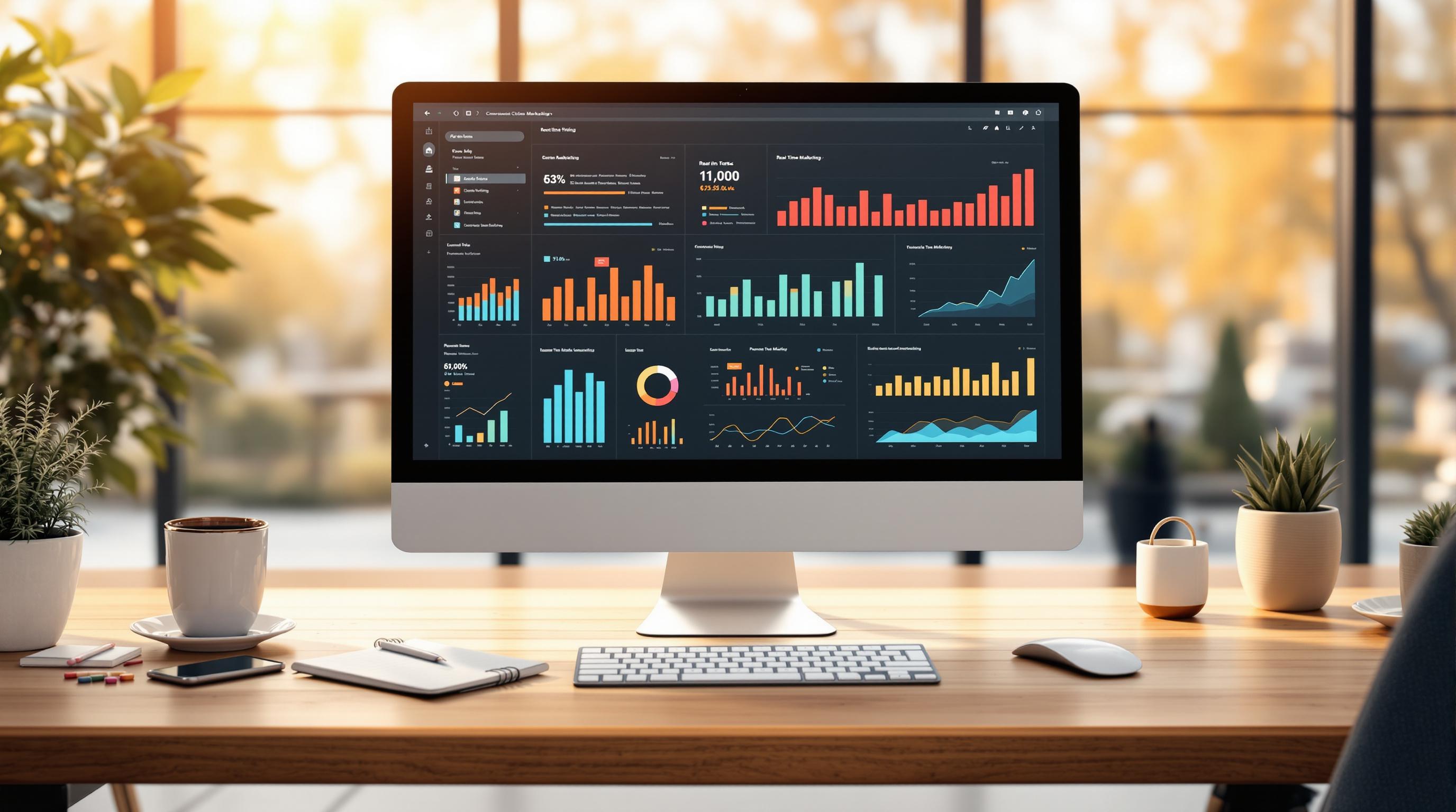
Scalable KPI dashboards help businesses monitor performance metrics in real time, grow with increasing data and user demands, and make faster decisions. This guide covers how to choose the right tools, set up effective dashboards, and improve them over time. Key features to look for include:
- Real-time updates for instant insights
- API integration to connect data sources
- Customizable permissions for secure team collaboration
- Mobile optimization for access anywhere
Key benefits of scalable dashboards:
- Faster decisions with real-time data
- Better visibility across channels
- Analytics that grow with your business
Follow this guide to build dashboards that align with your goals, track essential KPIs like CAC, CLV, and ROI, and maintain performance as your business scales.
Must-Have Features for KPI Dashboards
Main Dashboard Requirements
A good KPI dashboard should include features that make it easy to use, secure, and reliable. Key features include multi-user access to allow secure team collaboration and real-time updates so decision-makers always have the latest data.
Here are some essential technical features to look for:
- Data processing power to handle growing data volumes efficiently
- API integration for connecting various data sources
- Customizable user permissions to manage access levels
- Automated data refresh to keep information current
- Cross-device compatibility for seamless use on both desktop and mobile
These features should align with the KPIs that support your business goals.
Matching KPIs to Business Goals
Your dashboard should focus on KPIs that directly impact your business objectives. For marketing teams, this means tracking metrics that clearly show campaign performance and ROI. Key marketing KPIs include:
- Customer Acquisition Cost (CAC)
- Customer Lifetime Value (CLV)
- Conversion Rates by Channel
- Marketing Qualified Leads (MQLs)
- Return on Marketing Investment (ROMI)
Once you’ve identified the right KPIs, the next step is to ensure the dashboard design makes the data easy to understand and act on.
Dashboard Design Rules
The design of your dashboard plays a big role in how effectively it communicates data. The goal is to present information in a clear, actionable way. Use layouts that emphasize the most critical metrics and maintain a logical visual flow.
| Design Principle | Implementation | Impact |
|---|---|---|
| Visual Hierarchy | Place key KPIs in the top-left corner | Draws attention to essential metrics |
| Color Coding | Use consistent colors for related data | Makes patterns easier to spot |
| Data Density | Limit to 5–7 KPIs per view | Reduces information overload |
| Interactive Elements | Add drill-down options for deeper insights | Provides more detailed analysis |
| Mobile Optimization | Ensure responsive design for all devices | Enables access from anywhere |
Picking Dashboard Tools
Tool Selection Checklist
When selecting dashboard tools, it's important to focus on factors that meet your current needs while also supporting future growth. Here are the key areas to evaluate:
| Selection Factor | Key Considerations | Impact on Growth |
|---|---|---|
| Data Integration | Compatibility with APIs and data sources | Ensures smooth data flow across channels |
| Customization | Flexible layouts and widget options | Adjusts to changing business requirements |
| Performance | Data refresh rates and processing speed | Keeps efficiency intact as data increases |
| Security | Access controls and encryption features | Safeguards sensitive information as operations expand |
| Automation | Scheduled reports and alerts | Minimizes manual tasks as workload grows |
These factors provide a solid foundation for assessing tools. Use them as a starting point for deeper evaluations.
Using the Marketing Analytics Tools Directory

The directory is a helpful resource for analyzing tools based on:
- Real-time Analytics: Look for tools that provide live updates and instant insights.
- Cross-Channel Integration: Ensure compatibility with your existing marketing tech stack.
- Campaign Tracking: Confirm that the tool supports your specific marketing KPIs.
- Scalability: Verify the tool can manage increasing data volumes and user demands.
Once you've shortlisted tools, dive deeper by comparing their features and technical specifications.
Tool Comparison Methods
After identifying potential tools, use a structured approach to evaluate their fit for your needs. Here are three effective methods:
1. Feature Analysis Matrix
Create a list of essential features and compare how each tool delivers on them. Focus on features that directly impact your ability to track KPIs and support business growth.
2. Technical Requirements Assessment
Review the technical aspects of each tool, including:
- Server and hosting requirements
- Data processing limits
- API call restrictions
- User capacity
- Storage options
3. Growth Compatibility Check
Evaluate how well each tool aligns with your long-term goals. Consider factors like:
- Ability to handle larger data volumes
- Support for an expanding user base
- Integration with future systems
- Flexibility to adjust to new KPIs
When using the Marketing Analytics Tools Directory, prioritize tools with enterprise-level features like cross-channel integration and advanced analytics. These capabilities will help you scale without sacrificing performance.
How to Create a KPI Dashboard? | 4 Common Methods
sbb-itb-5174ba0
Dashboard Setup and Improvement
Once you've chosen the right tools, the next step is setting up your dashboard effectively and ensuring it keeps improving.
Steps to Set Up Your Dashboard
Follow these steps to create a functional and scalable KPI dashboard:
-
Requirements Gathering
- Identify stakeholder needs, including key metrics tied to business goals.
- Determine necessary data sources, access levels, and reporting frequency.
-
Data Source Configuration
- Securely connect data sources using authenticated API connections.
- Schedule regular data refresh intervals.
- Apply validation rules to ensure data integrity.
- Map data fields clearly to match your dashboard structure.
-
KPI Implementation
- Start with core metrics, such as revenue or conversion rates.
- Gradually add additional metrics as needed.
- Include trend indicators and set up automated alerts for key changes.
Once the dashboard is set up, focus on arranging the data in a way that maximizes clarity and usability.
Tips for Dashboard Layout
A well-organized layout makes it easier to understand data at a glance. Here are some design principles to follow:
| Layout Element | Best Practice | Impact |
|---|---|---|
| Information Hierarchy | Place the most critical KPIs in prominent spots | Speeds up decision-making |
| Visual Groups | Group related metrics together | Highlights data relationships |
| White Space | Use enough white space to avoid clutter | Simplifies the visual layout |
| Color Coding | Stick to a consistent color scheme | Makes data easier to interpret |
Additional layout tips:
- Focus on displaying only the most important metrics.
- Use clear and consistent labels for all elements.
- Include contextual notes to provide extra clarity.
- Show indicators for when data was last updated.
Improving Dashboards Over Time
Setting up your dashboard is just the beginning. Regular updates and improvements are key to keeping it effective.
Boosting Performance
- Check load times and overall system performance.
- Analyze user engagement to see which areas need improvement.
- Ensure data accuracy and adjust KPI thresholds as needed.
Incorporating User Feedback
- Use surveys to gather input from users.
- Keep track of feature requests and suggestions.
- Make updates based on user needs and insights.
Technical Maintenance
- Audit data refresh rates regularly.
- Remove unused or outdated metrics.
- Fine-tune queries and visualizations for better efficiency.
For further support, the Marketing Analytics Tools Directory provides resources to help with advanced analytics and dashboard customization.
Data Quality and Security
Ensuring Data Accuracy
Accurate data is the foundation of reliable KPI dashboards. Here’s how you can maintain it:
- Automate updates and validations to reduce manual errors.
- Enforce strict access controls to limit who can input or modify data.
Protecting Your Data
As your system grows, keeping your data safe becomes even more critical. Use role-based access controls to define who can access specific information and follow well-documented security protocols.
Monitoring and Maintenance
To keep your dashboards running smoothly and securely, regular system checks are a must. These checks should include:
- Tracking performance metrics
- Planning for capacity upgrades
- Adjusting settings to maintain accuracy and security
Need help with advanced analytics or optimizing dashboards? Check out the Marketing Analytics Tools Directory for additional resources.
Conclusion
Key Takeaways
Creating effective KPI dashboards requires a strong focus on accurate data, secure access, and constant fine-tuning. Here are the core practices to prioritize:
- Automate data checks to ensure reliability.
- Track performance consistently to identify trends and issues.
- Schedule regular reviews to keep dashboards aligned with goals.
- Use role-based access controls to protect sensitive information.
With these strategies in place, you’re ready to move forward with confidence.
Steps to Get Started
Now that you have a solid foundation, it’s time to put these strategies into action. When selecting and setting up your tools, focus on platforms that provide:
- Real-time analytics
- Campaign tracking across channels
- Seamless data integration
- Customizable dashboard options
Here’s how to proceed:
-
Choose the Right Tools
Select tools from the Marketing Analytics Tools Directory that align with your business size and objectives. -
Plan the Implementation
Develop a detailed timeline that includes:- Identifying key data sources
- Setting up security protocols
- Training your team
- Establishing performance monitoring routines
-
Focus on Continuous Improvement
Build processes to ensure ongoing optimization:- Regularly review KPIs
- Gather feedback from users
- Automate monitoring where possible
- Double-check data accuracy frequently
Dashboard optimization isn’t a one-time task. It’s an evolving process that requires consistent effort to keep your insights relevant and actionable.
FAQs
What key features should I look for in a scalable KPI dashboard tool?
When selecting a tool for a scalable KPI dashboard, focus on features that ensure flexibility, usability, and performance. Here are some of the most important aspects to consider:
- Customizability: The tool should allow you to tailor dashboards to meet your specific business needs, including adding or modifying KPIs as your goals evolve.
- Real-Time Data Integration: Ensure the tool can connect with your data sources and update metrics in real time for accurate and timely decision-making.
- Scalability: The platform should handle increasing amounts of data and users as your business grows without compromising performance.
Additionally, prioritize intuitive interfaces, robust reporting capabilities, and compatibility with other tools in your tech stack to streamline workflows and enhance insights.
How can I keep my KPI dashboard effective and aligned with business goals as my company grows?
To ensure your KPI dashboard remains effective as your business evolves, focus on regular updates and alignment with your goals. Start by reviewing your key performance indicators (KPIs) periodically to ensure they reflect your current objectives and priorities. As your company grows, your goals may shift, so it's important to adapt the dashboard accordingly.
Additionally, invest in scalable tools and integrations that can handle increasing data volume and complexity. Choose platforms that allow for customization, support real-time data updates, and offer insights that are actionable. Regularly gather feedback from your team to identify areas for improvement and ensure the dashboard continues to meet organizational needs effectively.
What are the key best practices for creating a KPI dashboard that presents data clearly and effectively?
Designing a clear and effective KPI dashboard starts with understanding your audience and their goals. Focus on selecting key metrics that align with business objectives, avoiding clutter by only including the most relevant data points. Use a logical layout that prioritizes important information at the top or center of the dashboard, ensuring it’s easy to interpret at a glance.
To enhance readability, use consistent colors, fonts, and chart types. For example, use green for positive trends and red for negative ones, but avoid overloading the dashboard with too many colors. Keep labels concise, and ensure charts and graphs are appropriately scaled for accurate comparisons.
Regularly review and update your dashboard to reflect changing business priorities or data sources. A well-maintained dashboard ensures stakeholders always have access to actionable and up-to-date insights.


