If you need a mobile dashboard in 2026, the short list is clear: Databox for fast KPI checks, AgencyAnalytics for agency client reporting, Power BI and Tableau for enterprise reporting, and Mixpanel for product and growth teams.
I reviewed 10 tools with the same mobile lens: phone layout, chart readability, touch filters, drill-downs, alerts, sharing, load time, marketing integrations, and U.S. pricing. The main takeaway is simple - most tools work on mobile for viewing and light interaction, but only a few feel easy to use on a phone every day.
If you are choosing now, focus on 3 things first:
- Can your team read KPIs on a 6-inch screen without zooming?
- Do alerts, filters, and sharing work well by touch?
- What will the tool cost after 12 to 24 months - not just month 1?
A few patterns stand out:
- Enterprise teams: Power BI, Tableau, Domo, and Sisense fit governed analytics tools for business and exec use.
- Marketing teams and agencies: Databox, AgencyAnalytics, and Whatagraph fit client updates and KPI review.
- Product and growth teams: Mixpanel fits funnels, retention, and anomaly alerts.
- Google-stack teams: Looker Studio stays a low-cost option, but mobile quality depends a lot on report design.
- Data-heavy teams: Funnel is more of a data layer than the mobile dashboard itself.
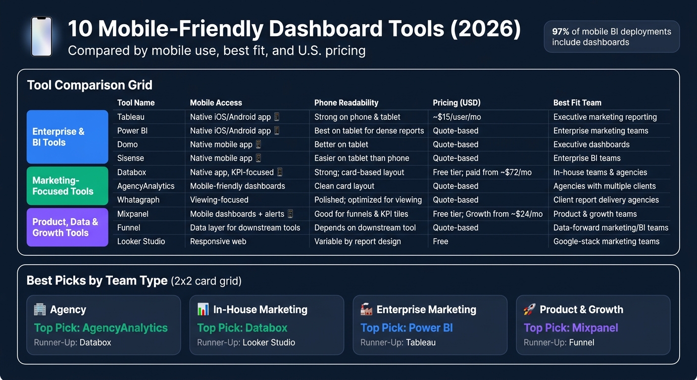
Mobile use is no longer a side case. The article notes that 97% of mobile BI deployments include dashboards, which explains why dashboard usability on phones now matters as much as desktop reporting for many teams.
10 Mobile-Friendly Dashboard Tools Compared (2026)
Your journey to amazing mobile dashboards
sbb-itb-5174ba0
Quick Comparison
| Tool | Mobile use | Best fit | Pricing |
|---|---|---|---|
| Tableau | Native app, strong viewing and filters | top website analytics tools for executive marketing reporting | From about $15/user/month |
| Power BI | Native app, best for curated reports | Enterprise marketing teams | Quote-based |
| Domo | Native app, KPI monitoring | Exec dashboards | Quote-based |
| Sisense | Native app, tablet-friendly use | Enterprise BI teams | Quote-based |
| Databox | Native app, KPI cards and alerts | In-house teams and agencies | Free tier, paid from about $72/month |
| AgencyAnalytics | Mobile-friendly dashboards | Agencies with many clients | Quote-based |
| Whatagraph | Mobile viewing, less interaction | Client report delivery | Quote-based |
| Mixpanel | Mobile dashboards and alerts | Product and growth teams | Free tier, paid from about $24/month |
| Funnel | Downstream data layer | Data-forward reporting teams | Quote-based |
| Looker Studio | Responsive web | Google-stack marketing teams | Free |
My read: if mobile use is daily, keep the dashboard simple, test it on iPhone and Android over cellular, and model total cost in USD before you buy. That is where most teams find the right fit - or the hidden pain.
Below, I break down which tools make sense by team type, mobile use case, and budget.
The 10 Mobile-Friendly Dashboard Tools
Enterprise and BI Tools: Tableau, Microsoft Power BI, Domo, Sisense
These 4 tools make sense for teams that already have structured data and want mobile access to dashboards used for executive pipeline, spend, and performance reporting. The key point is simple: on mobile, these tools are built for viewing and interacting with dashboards, not building them.[1][5][11] Report creation stays on desktop or web. On phones and tablets, the job is to scan KPIs, apply filters, and act on data that has already been set up.
Use the table below to compare native apps, alerts, and fit for executive reporting.
Tableau Mobile supports touch-based filtering, highlighting, drill-downs, favorites, and interactive offline previews. That gives executives and field teams a way to review high-level KPIs even with limited connectivity.[1][4]
Microsoft Power BI has native iOS and Android apps for dashboard viewing and interaction. It is worth testing your own reports on a phone, since dense layouts can get cramped. In many cases, tablets are easier to use for complex report designs.
Domo has a native mobile app that works well for executive KPI checks on a phone. Pricing is sales-led and quote-based.
Sisense also has a native mobile app. The main things to test are screen density, thumb-friendly filters, and whether your dashboards work better on tablets than phones. Pricing is quote-based.
| Tool | Mobile Access | Phone Readability | Filters/Drill-Downs | Alerts | Sharing | Pricing (USD) | Best Fit |
|---|---|---|---|---|---|---|---|
| Tableau | Native iOS/Android app | Strong on both phone and tablet; offline previews | Touch-based filtering, highlighting, drill-downs | Data-driven alerts | Commenting, subscriptions | ~$15/user/mo (Viewer, annual)[9][11] | Executive marketing reporting |
| Power BI | Native iOS/Android app | Best tested on tablet for dense reports | Touch interaction; varies by report design | - | - | Quote-based | Enterprise marketing reporting teams |
| Domo | Native mobile app | Often better on tablet for KPI monitoring | Touch filters; executive KPI focus | - | - | Quote-based | Executive marketing dashboards |
| Sisense | Native mobile app | Often easier on tablet than phone | Thumb-friendly filters; screen density varies | - | - | Quote-based | Enterprise BI and marketing teams |
Marketing-Focused Dashboard Tools: Databox, AgencyAnalytics, Whatagraph
These 3 tools are built for marketing teams that need quick KPI checks, client updates, and executive reporting on a phone. Setup is usually faster than with enterprise BI tools. The best dashboards here use clean, card-based layouts that stay readable without pinching and zooming. In plain terms, these tools favor fast client reads and simple mobile sharing over deep modeling.
Databox prices by data sources instead of seats, and most paid tiers include unlimited users and dashboards. That makes team-wide or client-wide mobile rollout easier.[7][3] Its mobile app centers on KPI scorecards, goal tracking, and alerts. Plans start with a free tier and scale based on data sources and refresh frequency.[7][3]
AgencyAnalytics is built for agencies handling multiple client accounts. Its mobile experience focuses on client-facing dashboards and scheduled report delivery, with clean card layouts that cut down on zooming. It is not the tool for heavy data modeling, but it works well when the main job is getting results in front of clients fast.
Whatagraph is more of a viewing layer, with limited mobile filtering. It is set up for presentation-ready reports built on desktop and reviewed on mobile by clients or other stakeholders. That sets it apart from Databox and AgencyAnalytics, which offer more mobile interaction.
| Tool | Mobile Access | Phone Readability | Filters/Drill-Downs | Alerts | Sharing | Pricing (USD) | Best Fit |
|---|---|---|---|---|---|---|---|
| Databox | Native app, KPI-focused | Strong; card-based layout | Goal tracking, date and campaign filters | Threshold and goal alerts | Quick sharing, snapshots | Free tier; paid from ~$72/mo (annual, 3 sources)[7][3] | In-house teams, agencies, KPI monitoring |
| AgencyAnalytics | Mobile-friendly client dashboards | Clean card layout; minimal zoom needed | Basic filters; limited drill-downs | - | Scheduled client report delivery | Quote-based | Agencies with multiple client accounts |
| Whatagraph | Viewing-focused on mobile | Polished; optimized for viewing | Limited mobile filtering | - | Report sharing; desktop build, mobile review | Quote-based | Agencies focused on client report delivery |
Product, Data Pipeline, and Growth Tools: Mixpanel, Funnel, Looker Studio
These 3 tools do different jobs, so you should judge their mobile use in that context. Mixpanel is for product and growth analytics. Funnel handles the data behind mobile dashboards and usually works best when paired with another front-end dashboard tool. Looker Studio is a lighter dashboard layer for Google and partner data sources. This group fits cases where better upstream data or product analytics matters as much as the dashboard itself.
Mixpanel has a free plan and a usage-based Growth tier, which makes it accessible for smaller growth teams.[8][10] Its mobile dashboards are useful for checking funnels and retention curves, and anomaly or threshold alerts can be pushed to mobile.[10][6]
Funnel is a data pipeline and attribution tool for multi-source marketing reporting. It supports downstream dashboards rather than acting as the mobile dashboard itself. Pricing is quote-based.
Looker Studio is free, responsive on mobile, and a strong fit for teams already working inside Google data sources such as Google Ads, GA4, and BigQuery.
| Tool | Mobile Access | Phone Readability | Filters/Drill-Downs | Alerts | Sharing | Pricing (USD) | Best Fit |
|---|---|---|---|---|---|---|---|
| Mixpanel | Mobile dashboards + alerts | Good for funnels and KPI tiles, but dense on small screens | Useful for funnel and retention review | Anomaly and threshold alerts | - | Free (1M events/mo); Growth from ~$24/mo[8][10] | Product and growth teams |
| Funnel | Data layer for downstream dashboards | Depends on downstream tool | Limited | - | - | Quote-based | Data-forward marketing and BI teams |
| Looker Studio | Responsive web | Variable; depends on report design | Varies by report design | - | - | Free | Google-stack marketing teams |
Best Picks by Marketing Team Use Case
Use the list above to narrow your options by team size and reporting need.
Best for Agencies, In-House Teams, and Enterprise Marketing
On mobile, use case matters more than feature count.
For agencies, the best fits are Databox, AgencyAnalytics, and Whatagraph. Databox works well for account managers who need fast, per-client KPI checks. AgencyAnalytics is a good fit for teams that want client-facing dashboards without asking clients to open a laptop. Whatagraph makes sense for agencies that care most about polished, scheduled report delivery.
For lean in-house teams, Databox and Looker Studio stand out. Databox makes it simple to review KPIs, track goals, and set alerts from a phone. Looker Studio is free and works well for teams that already live in Google tools, though mobile readability depends a lot on how well the report was built.
For enterprise marketing teams that need governed reporting and cross-functional visibility, Tableau, Power BI, Domo, and Sisense are the stronger picks. On mobile, these tools are used mostly to view curated dashboards, not build them. Mixpanel fits enterprise product and growth teams that track in-app behavior. Funnel sits upstream and prepares data before it flows into the BI tool used for mobile reporting.
Best for Real-Time Monitoring, Executive Dashboards, and Revenue Reporting
For mobile dashboards, the next call is how fast the team needs to react.
For real-time marketing analytics, Databox is the most practical pick. Alerts fire when a metric crosses a threshold, so a performance marketer can filter by campaign and act before a small issue turns into a bigger one. AgencyAnalytics also helps agencies and in-house teams spot outliers in spend or conversions without manually scanning charts.
For executive dashboards, simple wins. Keep the view to a small set of metrics, use large text, choose trend lines over dense tables, and stick to consistent U.S. number formatting such as $1,250,000 instead of shortened figures that can hide context. Databox's scheduled scorecards let CMOs and CEOs get concise summaries without logging in.[2][12]
For revenue reporting, pair Funnel with Power BI or Tableau to review pipeline, ARR, and channel cost on mobile during business reviews.
How to Choose the Right Mobile Dashboard Tool
Use this checklist to confirm mobile fit and total cost before you buy.
Test Mobile Experience Before You Buy
Test on real phones and tablets, including one tablet such as an iPad. Run the same checks on both Wi-Fi and cellular. On cellular, aim for load times under 5 seconds. That’s where tools often fall apart in day-to-day use.
Check the basics first:
- Device types: Test on an iPhone, an Android phone, and 1 tablet. Check both portrait and landscape.
- Network speed: Compare load times on Wi-Fi and cellular. Slow cellular performance is the most common failure point in day-to-day use.
- Core tasks: Make sure key KPIs are readable without zooming, filters work with a thumb, and alerts arrive on time.
One extra test is worth doing: have a marketer use the dashboard on a phone for a full workday. That will tell you fast whether basic analysis holds up without a laptop, or whether the mobile app is just a stripped-down viewer.
Compare Pricing, Access Models, and Scale
Pricing can look simple at first and get expensive later. Compare how each vendor charges for access and scale before you commit.
| Pricing Model | How It Works | Watch Out For |
|---|---|---|
| Seat-based | Per named user/month | Executive viewer counts add up fast |
| Usage-based | Billed by data volume, queries, or API calls | Surprise overages when campaigns scale |
| Account/flat-rate | One price for a user tier or workspace | May cap features at lower tiers |
| Client-based | Per client account/month | Grows directly with your client roster |
Build a 12-24 month cost model in USD using your actual user mix: analysts, managers, executives, and client viewers. This is where teams often miss the real number. Agencies, in particular, tend to undercount client-side viewer seats. PE-backed and multi-brand teams can also end up in premium tiers once they need cross-entity rollups or brand-level permissions for each GM.
Use a Directory to Find More Options
If none of the 10 tools fits your stack, widen the search. These 10 cover the main use cases, but the Marketing Analytics Tools Directory gives you a broader set of reporting dashboards, BI platforms, and campaign tracking tools by category. That makes it easier to find options that match a specific data stack or team setup. It can also help teams that need reporting built around revenue and EBITDA.
Conclusion: Which Mobile Dashboard Tools Stand Out in 2026
The best picks split cleanly by team type. Power BI and Tableau work best for social media and enterprise reporting. Databox and AgencyAnalytics make more sense for marketing teams. Mixpanel stands out for product-led growth.
What decides the winner in practice? Phone usability and total annual cost. List price is only part of the story. Your actual spend depends on user count, client count, and data usage.
Before you buy, score each tool against the things your team will deal with every day:
- mobile usability
- readability
- alerts
- sharing
- speed
- total annual cost
Use the summary below to line up each tool with the team most likely to get value from it.
| Team Type | Top Pick | Runner-Up |
|---|---|---|
| Agency | AgencyAnalytics | Databox |
| In-house marketing | Databox | Looker Studio |
| Enterprise marketing | Power BI | Tableau |
| Product & growth | Mixpanel | Funnel |
The best mobile dashboard is the one your team opens every day.
FAQs
Which tool is best for my team?
The right dashboard tool comes down to 3 things: your team’s technical skill, how messy or layered your data is, and what your marketing team needs to track.
Small teams usually do well with simple, template-based tools like SimpleKPI or Databox. They’re easier to set up, easier to use day to day, and a better fit when you don’t have a lot of analyst support.
If you need deeper customization and your team has solid data support, Tableau may be a better fit. It gives you more control, but it also asks more from the people building and maintaining reports.
For marketing-focused use cases like attribution or campaign performance, Whatagraph or Klipfolio can save time with automated insights and reporting flows. That matters when your team needs answers fast and doesn’t want to build every dashboard from scratch.
Keep your evaluation focused on a few practical points:
- Ease of use for the people who will live in the tool
- Integrations with your ad platforms, CRM, and analytics stack
- Real-time performance if your team needs up-to-date reporting
Pick the tool that matches how your team actually works, not the one with the longest feature list.
Do I need a native mobile app?
No. A native mobile app is not required. Many modern dashboard tools already give you mobile-friendly access in a browser.
What matters more is a dedicated mobile view, not a desktop dashboard shrunk to fit a phone screen. If the layout is built for mobile, your key KPIs and alerts stay easy to see without a lot of scrolling.
How should I test mobile dashboard usability?
Apply the 5-second rule: a new user should see the most important metric within 5 seconds. Then use free trials to test the dashboard against real business questions.
Make sure it loads in under 3 seconds, shows key metrics and alerts above the fold, and keeps filters and navigation easy to use on a small screen. Also get feedback from the people who use it every day.