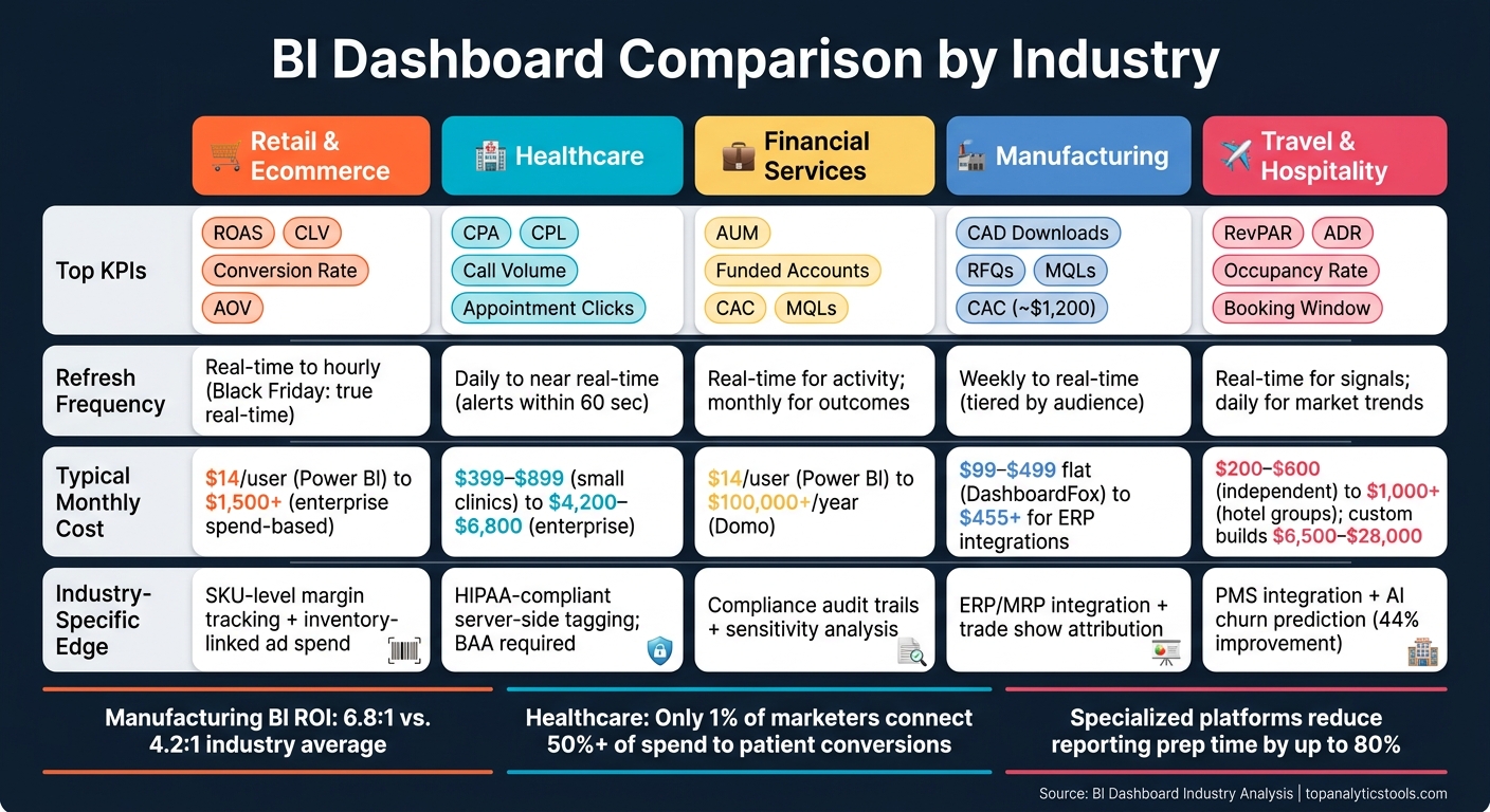
When choosing a BI dashboard for marketing, the right fit depends on your industry’s unique needs. Retail, healthcare, financial services, manufacturing, and travel all have specific data requirements, metrics, and compliance standards. Here's a quick breakdown:
- Retail and Ecommerce: Focuses on real-time ad spend and SKU-level profitability. Prioritizes metrics like ROAS, CLV, and Conversion Rates.
- Healthcare: Emphasizes HIPAA compliance, patient acquisition costs (CPA), and detailed engagement tracking like appointment clicks and call volume.
- Financial Services: Requires robust security (RLS) and tracks long sales cycles with metrics like AUM, funded accounts, and multi-touch attribution.
- Manufacturing: Tracks technical engagement signals like CAD downloads and RFQ submissions, integrating data from distributors and trade shows.
- Travel and Hospitality: Combines historical data with real-time trends, focusing on RevPAR, ADR, occupancy rates, and booking windows.
Quick Comparison
| Industry | Key Metrics | Data Refresh Needs | Pricing Models | Industry-Specific Features |
|---|---|---|---|---|
| Retail & Ecommerce | ROAS, CLV, Conversion Rates | Real-time to hourly | Per-seat, flat-rate, spend-based | SKU-level margin tracking, inventory-linked campaigns |
| Healthcare | CPA, CPL, Call Volume | Daily to near real-time | Subscription or enterprise | HIPAA compliance, call tracking, reputation metrics |
| Financial Services | AUM, Funded Accounts, CAC | Real-time for activity, monthly for outcomes | Per-seat, MAU, enterprise | Compliance audit trails, sensitivity analysis |
| Manufacturing | CAD Downloads, RFQs, MQLs | Weekly to real-time | Per-seat, capacity-based | ERP integration, trade show attribution |
| Travel & Hospitality | RevPAR, ADR, Occupancy Rates | Real-time for signals, daily for trends | Subscription or custom builds | PMS integration, predictive analytics |
Each dashboard type aligns with the unique pace and complexity of its industry. Retail thrives on real-time updates, healthcare demands compliance, and financial services focus on precision. Manufacturing bridges operations and marketing, while travel benefits from predictive tools.
To choose the right dashboard, consider your metrics, data refresh needs, and compliance requirements. Specialized tools often save time and resources, while general BI platforms provide flexibility for broader use cases.
BI Dashboard Comparison by Industry: Key Metrics, Refresh Rates & Pricing
Power BI for Marketing Explained - 2026 Edition 🔥
1. Retail and Ecommerce Dashboards
In the fast-paced world of retail and ecommerce, dashboards play a crucial role in driving timely decisions and boosting profitability. Marketing teams are constantly juggling dynamic data - ad spend, inventory, order volumes, and customer behavior - all of which can shift by the hour. A well-designed BI dashboard must keep up with this ever-changing landscape.
Core KPIs
Retail dashboards typically focus on five key areas: Acquisition (like Cost Per Acquisition and Customer Acquisition Cost), Revenue (such as ROAS and Average Order Value), Engagement (including Conversion Rate and Bounce Rate), Volume (Orders and Sessions), and Efficiency (CPC and Impression Share). Advanced platforms go a step further by tracking Contribution Margin (CM1–CM3), which accounts for shipping, returns, and discounts, offering a clearer view of net profit compared to surface-level ROAS. Metrics like Customer Lifetime Value (CLV) and cohort-based repeat purchase rates provide additional insights, helping businesses understand if their acquisition efforts are building a loyal customer base or just driving one-off sales.
To keep dashboards effective and user-friendly, limit the number of metrics displayed to 8–12. This prevents overwhelming users with excessive data.
Customization
One-size-fits-all dashboards rarely meet the diverse needs of retail teams. For example, a CMO may need a high-level revenue overview, while a media buyer requires detailed, channel-specific ROAS data. Many platforms now offer role-specific views and drag-and-drop customization. Take Dema, for instance - it provides over 100 pre-modeled metrics and 40 dimensions, including profit variants from GP1 to CM3. This flexibility allowed Aim'n, a Swedish activewear brand, to achieve a 123% increase in Gross Profit 3 (GP3) during a Black Friday campaign.
"For me, Zoho Analytics is a complete BI solution to look into and diagnose my business very quickly, that too in an ever-changing e-commerce environment. This solution helps us to look at trends and detect things early, saving us a substantial amount of time and money." - Juan Martitegui, Co-Founder, Ecom Ventures
Customizable views like these enable faster data updates and more accurate pricing decisions.
Data Refresh Frequency
Speed is everything in retail. Advanced platforms use technologies like Kafka streams and Redis queues to deliver metrics in real time. Even mid-tier tools aim for load times under 2 seconds with over 20 active widgets. For most teams, a refresh rate of 15–60 minutes is sufficient for daily operations. However, during high-stakes periods like Black Friday or Cyber Monday, true real-time data can make or break budget allocation decisions.
Having access to up-to-the-minute insights ensures smarter spending and quicker adjustments, especially when pricing models come into play.
Pricing Models
The pricing structure of a BI tool can significantly impact costs as a business scales. Here's a look at common models:
| Model | Example Tool | Cost | Best For |
|---|---|---|---|
| Per-seat | Power BI Pro | $14/user/month | Corporate teams with fixed headcount |
| Flat-rate | Briezo | $89/month (10 stores) | Growing DTC brands |
| Spend-based | Fospha Lite | $1,500/month ($100K–$500K media spend) | Enterprise retail with high ad budgets |
| Entry-level SaaS | Zoho Analytics | $24/month (2 users, billed annually) | Small to mid-size retailers |
Flat-rate models are particularly appealing to growing brands, as they avoid unexpected charges. Briezo emphasizes this point:
"Your bill should not climb the second your business does. Every plan is a flat rate at every revenue level, with no GMV fee, no order-volume penalty, and no surprise mid-quarter overage charges."
It's also essential to consider hidden costs like data warehousing, implementation fees, and third-party connectors, which can inflate the total budget by 2–3 times the initial license price. Factoring in the total cost of ownership upfront is key.
Industry-Specific Features
Retail-focused platforms excel by aligning marketing spend with inventory data, flagging issues like ad budgets promoting out-of-stock or low-margin items - problems generic dashboards often overlook. For example, Dema can push exclusion rules directly to Google and Meta ad feeds. Other standout features include RFM segmentation (Recency, Frequency, Monetary), LTV forecasting, and cohort analysis. These tools are invaluable for ecommerce teams aiming to fine-tune their strategies.
For brands struggling with attribution gaps caused by iOS 14+, server-to-server data pushback can improve reported ROAS by up to 90%. This capability is worth prioritizing when evaluating platform options.
2. Healthcare Dashboards
Healthcare marketing operates in a unique space, shaped by strict privacy rules, intricate patient journeys, and an intense focus on ROI. Unlike retail dashboards, healthcare dashboards must address these specialized demands where the stakes are considerably higher.
Core KPIs
Healthcare dashboards need to monitor a variety of metrics, especially those tied to patient acquisition and engagement. For example, tracking Cost Per Acquisition (CPA), Cost Per Lead (CPL), and healthcare-specific ROAS metrics is essential. These metrics often include phone-based conversions, as a significant portion of healthcare bookings - 40–60% - happens over the phone. This makes tools like call tracking and dynamic number insertion (DNI) critical.
Beyond acquisition, dashboards must capture key engagement signals such as appointment form submissions, appointment clicks, and direction requests, as these directly reflect campaign effectiveness.
| KPI Category | Key Metrics |
|---|---|
| Patient Acquisition | CAC, CPL, CPA |
| Conversion Actions | Appointment Form Submissions, Call Volume, Appointment Clicks |
| Local SEO | Google Business Profile Views, Keyword Rankings, Direction Requests |
| Reputation | Patient Satisfaction Scores, Google/Yelp Review Ratings |
| Website Performance | Sessions, Bounce Rate, New vs. Returning Visitors |
Reputation metrics, such as patient satisfaction scores and online reviews, are particularly impactful. In healthcare, trust plays a direct role in attracting new patients.
For multi-location healthcare groups, the need for tailored dashboard views becomes even more pressing.
Customization
Healthcare groups with multiple locations often require dashboards that can break down performance by service line. For instance, a marketing director might need to compare cardiology campaign results with orthopedics instead of seeing blended data. Features like service line filters and provider-level rollups make executive decision-making more effective.
One healthcare group streamlined over 300 corporate websites into a single KPI dashboard, standardizing performance metrics across international teams managing 50–200+ clinics.
"Our goal was not just to deliver a dashboard or harmonize data, but to truly enable the company to make data-driven decisions." - Carolin Quast, Team Lead "Analytical CRM", Hopmann Marketing Analytics
Data Refresh Frequency
While healthcare marketing doesn’t demand the same speed as retail, daily updates are still critical. This allows teams to adjust budgets before campaigns veer off course. Advanced platforms now offer near-real-time alerts - within 60 seconds - for missed booking opportunities. Automating reporting also saves teams the 4–8 hours typically spent manually compiling data.
"Reports had to be rebuilt every time and exported. We wanted to automate the process and easily distribute reports in a much cleaner format." - Daniel Quinn, VP of Business Strategy and Analytics, LionShare
Pricing Models
The specialized requirements of healthcare dashboards lead to varied pricing structures. Smaller clinics often use tools like Weave ($399–$899/month), which combines communication features with basic analytics. Larger groups, such as multi-location dental or specialty practices, may turn to platforms like Patient Prism ($3,000–$8,000/month) or PeerLogic ($1,500–$4,000/month) for more advanced capabilities like call analytics and revenue tracking.
Enterprise-level health systems, managing 10 or more hospitals, might use infrastructure like Snowflake (around $4,200–$6,800/month for compute and storage) paired with middleware connectors.
HIPAA compliance adds another layer of cost. For example, replacing client-side pixels with server-side tagging can cost $100–$500/month, depending on traffic volume. Building an in-house, fully compliant BI stack may run between $2.5 million and $7 million over three years, compared to $250,000–$800,000 for pre-built platforms.
Industry-Specific Features
HIPAA compliance is the cornerstone of healthcare BI dashboards. Standard dashboards often collect sensitive data - like IP addresses or user IDs - that could expose Protected Health Information (PHI). This can result in penalties ranging from $137 to $68,928 per violation. A compliant dashboard intercepts data server-side, removes identifiers based on HIPAA's Safe Harbor guidelines, and forwards only de-identified data downstream.
For example, in 2025, CU Medicine implemented Freshpaint's privacy-first marketing platform across its 75+ clinics. Led by Michelle Malgesini, the project recovered 4–6 months of lost performance data while adhering to OCR tracking guidelines. The results were impressive: a 5–25% reduction in patient acquisition costs and up to a 50% drop in cost-per-click. Additionally, any vendor working with healthcare organizations must sign a Business Associate Agreement (BAA) to ensure HIPAA compliance.
3. Financial Services Dashboards
Marketing in the financial services sector operates in a league of its own. Sales cycles often stretch from 6 to 18 months, and conversions aren't as straightforward as online checkouts. Instead, they involve milestones like funded accounts, advisor meetings, or assets under management. Add to this the strict regulatory requirements, and it’s clear that business intelligence (BI) dashboards in this industry have to work harder than in most others.
This highlights how industries shape their dashboards to meet unique demands - whether it’s the fast-paced decision-making in retail or the stringent compliance needs in financial services.
Core KPIs
Unlike retail or healthcare, financial services dashboards require even more precision and compliance due to extended sales cycles and regulatory oversight.
Metrics in financial dashboards are typically grouped into three levels:
- Activity: Metrics like impressions, clicks, and email opens.
- Pipeline: Metrics such as Marketing Qualified Leads (MQLs), SQL conversion rates, meeting requests, and cost per lead.
- Business Outcomes: These include AUM (Assets Under Management) growth, funded accounts, revenue influenced, and Customer Acquisition Cost (CAC).
While many industries stop at the first or second level, financial services focus heavily on Tier 3. These are the metrics that matter most to decision-makers like the CMO, CFO, and CEO.
Given the long conversion cycles, multi-touch attribution is crucial. Unlike retail, where last-click models might suffice, financial services need to connect multiple touchpoints. As the WOLF Financial team aptly put it:
"If your reporting cannot connect a LinkedIn campaign to a pipeline opportunity to a closed account, you are reporting activity, not impact."
Customization
Financial dashboards must cater to specific roles while ensuring compliance and data segregation through robust row-level security (RLS). For instance, a compliance officer might need access to audit trails for FINRA Rule 2210 and SEC Marketing Rule pre-approvals, whereas a campaign manager would focus on metrics like cost-per-lead by channel. Mixing these into a single view creates confusion and undermines trust in the data.
A great example of tailored dashboards is Charles Schwab’s use of Uptempo. With this platform, the CMO could generate real-time reports on media spend across agencies and vendors. This visibility allowed the team to quickly identify a 10% variance in spending that could be reallocated.
"We can show progress and results in real-time. When the CMO wants to know how much of the media team's money is committed, a report can be generated quickly." - Charles Schwab
Data Refresh Frequency
In financial services, not all KPIs update at the same pace. It’s essential to distinguish between "fresh" metrics (real-time updates) and "finalized" metrics (settled outcomes). For example:
- Real-time updates: Paid media spend and pipeline metrics.
- Monthly or quarterly updates: Business outcomes like AUM or revenue influenced, which require data settlement and account for long conversion windows.
This approach ensures executives aren’t making decisions based on incomplete data.
Pricing Models
Choosing the right pricing model depends on how often users interact with the dashboard. Per-seat pricing, common with tools like Power BI ($14/user/month) and Tableau (starting at $15/user/month for Viewer), can become costly when only 30–50% of accounts are actively used.
For organizations with fluctuating usage, Monthly Active User (MAU) models, like DashboardFox ($99–$499/month based on user count), can save 40–60% compared to per-seat pricing.
For larger-scale deployments, enterprise solutions like Domo typically range from $50,000 to over $100,000 annually, while Salesforce Marketing Cloud Intelligence averages $3,000 per organization per month. However, advanced features like row-level security often come at a premium. For instance, Metabase only includes RLS in its $575/month Pro plan.
Industry-Specific Features
Two standout features make finance-grade dashboards distinct:
- Compliance Audit Trails: These track every campaign pre-approval, communication archive, and data export. This transforms regulatory reviews from stressful events into routine processes.
- Sensitivity Analysis: This feature models ROI changes based on variables like conversion or interest rates. It offers executives multiple perspectives - best, base, and downside scenarios - rather than a single return-on-ad-spend figure.
Data security is also a top priority. With the average cost of a data breach in financial services reaching $6.08 million per incident, enterprise platforms often offer private VPC or on-premise deployments to meet strict data residency requirements. Vendors in this space must comply with frameworks like SOC 2 Type II, PCI-DSS, SOX, and GLBA - these aren’t optional but mandatory. These specialized features set financial dashboards apart from those in other industries, where precision and compliance are less critical.
sbb-itb-5174ba0
4. Manufacturing Dashboards
Manufacturing marketing comes with its own set of challenges. Long sales cycles - often lasting 12–24 months - are common, and buying decisions frequently involve committees from engineering, procurement, and finance. Add to that the reliance on indirect distribution channels, and it becomes clear that BI dashboards in this sector need to bridge the gap between factory operations and marketing funnels while maintaining accurate data. This trend aligns with a broader movement across industries where tailored dashboards support smarter marketing strategies.
Core KPIs
Manufacturing marketing dashboards go beyond the usual metrics, focusing on technical engagement signals and pipeline indicators. Successful manufacturers keep an eye on early buying intent signals like CAD file downloads, specification sheet views, and RFQ (Request for Quote) submissions. These touchpoints offer deeper insights into a prospect's decision-making process. Manufacturers leveraging advanced analytics see a marketing ROI of 6.8:1 compared to the industry average of 4.2:1. Campaigns tracked through these tools generate 34% more qualified leads, with the average Customer Acquisition Cost (CAC) for an industrial lead around $1,200.
Customization
One persistent issue in manufacturing marketing is the "distributor data gap", where there’s a disconnect between shipments and end sales. Dashboards tailored to this industry address the problem by integrating sell-through reports and co-op marketing spend data to calculate accurate channel ROI. They also incorporate Trade Show Attribution models, which connect badge scans to long-term pipeline results rather than just raw lead counts.
A great example of this customization comes from Boyd Corporation. Using HubSpot Marketing Hub, Boyd streamlined lead routing and removed bottlenecks between sales and service. This led to a 49% increase in Marketing Qualified Leads (MQLs) and a 16% rise in overall lead submissions. Julie Strachan, Senior Technical Marketing Manager, highlighted the benefits:
"In comparison to our large organization, we're a rather small marketing team. HubSpot enables us to scale our efforts and deliver an efficient and effective customer experience."
This kind of integration ensures that both operational and strategic data flow smoothly into performance evaluations.
Data Refresh Frequency
Manufacturing dashboards often cater to two distinct groups: operators who need near-real-time production data and marketing or executive teams who review performance weekly or monthly. A tiered refresh system works best - offering sub-second updates for operational data and 15–60 minute intervals for plant- or enterprise-level metrics. Weekly reviews help convert data into actionable strategies. As Kevin Golden, Partner at James Moore & Co., put it:
"If something's going off course, at best we find out 45 days late... and now you've lost all that opportunity."
Pricing Models
Pricing for manufacturing dashboards often depends on how actively users engage with the system. In many BI setups, only 30%–50% of provisioned accounts are actually used, making per-seat pricing costly. For example, Power BI Pro now costs $14 per user/month, while Tableau’s Viewer license starts at $15 per user/month. In contrast, models like DashboardFox ($99–$499/month) offer a more budget-friendly option for occasional users. For large manufacturers embedding dashboards for external distributors, capacity-based pricing - charging based on server resources instead of users - can make more sense. It’s also important to account for hidden costs, like ERP connectors. For instance, Zoho Analytics requires its Enterprise plan at $455/month to unlock premium ERP integrations.
Industry-Specific Features
Manufacturing dashboards stand out with features tailored to the industry. Account Engagement Scoring tracks interactions across engineering, procurement, and finance contacts within a single account, which is critical for multi-stakeholder purchase decisions. ERP/MRP integration connects production data with marketing pipeline visibility, helping to overcome traditional silos.
Zippo’s 2025 rollout of the Domo platform showcases the value of unified data. By creating shared dashboards across paid, owned, and social channels in 160 countries, Zippo increased attributed revenue by 12%, boosted cart flow revenue by 32%, and identified shipping inefficiencies that saved $250,000 annually. These connected systems not only improve reporting but also uncover cost savings that might otherwise go unnoticed.
5. Travel and Hospitality Dashboards
Travel and hospitality marketing comes with its own set of challenges. Seasonal demand, weather fluctuations, and airline schedules can all impact bookings, which means relying on last month’s data just won’t cut it. To stay ahead, BI dashboards in this sector need to combine historical data with long-term demand trends, helping marketing teams anticipate shifts in booking patterns and remain competitive on pricing.
Core KPIs
This industry focuses on metrics far beyond basic conversion rates. Key performance indicators include Revenue Per Available Room (RevPAR), Average Daily Rate (ADR), occupancy rates, and the booking window - the time between when a reservation is made and the guest’s arrival. On the marketing side, metrics like Return on Ad Spend (ROAS), cost per booking, and the direct booking ratio (Brand.com versus OTAs) are essential for evaluating campaign efficiency. Additionally, competitive benchmarking and forward-looking occupancy data allow teams to adjust campaign spending dynamically. Dashboards in this space need to offer flexible views that tie these specialized metrics together seamlessly.
Customization
Effective travel dashboards integrate data from multiple sources. Hospitality-specific dashboards bring together information from PMS, CRS, OTAs (like Expedia and Booking.com), and review platforms (such as TripAdvisor) into a unified view. Some platforms, like Bismart, allow hotels to select only the modules they need - whether for Revenue Management, Operations, or Marketing. These tools often provide quick access to operational insights.
A great example of customization is KLM, which linked its digital channels to CRM data to personalize interactions in real time. This resulted in a 5% boost in conversions and a 40% drop in cost per booking, with email value increasing by an impressive 800%. Jad Naciri, Cross-Channel Data Manager at Air France, shared:
"We needed a solution to connect all of our digital channels with our CRM. The Data Activation Platform helped us break down silos and implement an omnichannel strategy."
Data Refresh Frequency
Speed is critical in the travel sector. Signals like fare searches, availability checks, and cart abandonment require real-time tracking to trigger timely responses. Broader market trends, such as shifts in competitive ADR or forward occupancy data, are typically updated daily. Tools like DashThis enable live data syncing, significantly cutting down the time spent on manual reporting. Jonas Meister, Digital Marketing Strategist at GnuWorld, highlighted:
"The biggest benefit is the time saved in terms of data collection. It's also great that the design is very pretty out of the box."
Pricing Models
Pricing for travel dashboards varies based on the size of the property and the scope of its operations. Independent hotels often pay between $200 and $600 per month for analytics platforms, while larger hotel groups using tools like Duetto Scoreboard may spend more than $1,000 per month. Custom builds in Power BI, designed to integrate PMS, POS, and reservation data, typically cost between $6,500 and $28,000, with most projects landing around $12,500. Destination Marketing Organizations (DMOs) sometimes benefit from state-negotiated group rates or grants. For example, the Virginia Tourism Corporation covered the full cost of Arrivalist for DMOs with budgets under $3 million in 2026.
| Property Size | Recommended Approach | Typical Monthly Cost |
|---|---|---|
| Under 20 rooms | PMS native reports only | Included in PMS |
| 20–40 rooms | PMS native + manual Excel exports | Minimal |
| 40–80 rooms | PMS analytics add-ons (e.g., Mews Analytics) | Low-to-mid tier |
| 80+ rooms / Multi-property | Dedicated BI layer (e.g., M3, ProfitSword) | $500–$1,000+ |
Industry-Specific Features
Travel dashboards often include features tailored to this sector, such as channel attribution and guest behavior analysis. For instance, OTA versus direct channel attribution helps teams identify which channels drive bookings most efficiently, allowing them to shift budgets toward more cost-effective direct bookings. Integration with guest CRMs connects campaign performance to individual stay histories, loyalty tiers, and lifetime value, enabling precise marketing strategies like win-back campaigns or loyalty upgrades. Sentiment analysis tools aggregate reviews from platforms like Google, TripAdvisor, and Expedia, giving teams insight into brand reputation alongside performance data.
Predictive tools are gaining traction as well. AI-powered dashboards can improve churn prediction by 44% and reduce booking abandonment rates by 32%. Platforms like Cogwheel Analytics, priced at $150 per hotel per month, bundle benchmarking, paid media, social metrics, and review modules into one interface, making advanced insights accessible even to smaller properties.
Pros and Cons by Industry
This section outlines the standout benefits and challenges faced by different industries when using BI dashboards, summarizing the key takeaways from earlier analyses.
| Industry | Key Advantage | Key Disadvantage |
|---|---|---|
| Retail & Ecommerce | Real-time SKU-level margin tracking and inventory-linked campaign spend | Data fragmentation across multiple sources |
| Healthcare | EHR/CRM integration enables Patient Lifetime Value (LPV) tracking | HIPAA restrictions limit full attribution of certain conversion channels |
| Financial Services | Enterprise-grade RLS secures sensitive data | Steep learning curves and high license costs limit adoption |
| Manufacturing | Spreadsheet-native tools like Sigma enable non-technical teams to query large datasets, though the emphasis on grid-based analysis can limit deeper insights | Limited visualization depth; dashboards tend to be grid-heavy rather than insight-driven |
| Travel & Hospitality | Native PMS analytics cover core metrics like RevPAR and occupancy at zero extra cost | Small properties often find dedicated BI tools hard to justify - a $400/month tool requires even a modest RevPAR increase to justify its cost |
Industry-Specific Insights
Each industry faces unique opportunities and obstacles when implementing BI dashboards. For instance, retail and ecommerce excel at leveraging data to tie marketing spend directly to SKU-level profitability. However, the sector struggles with fragmented data sources, which makes achieving a unified view of performance difficult. As one industry expert notes:
"Retail is drowning in data and starving for insight - the average multi-location retailer generates over 1 terabyte of transactional data per year but uses less than 12% of it for decision-making."
In healthcare, while integrating EHR and CRM systems allows for tracking Patient Lifetime Value, strict HIPAA regulations create barriers. These compliance requirements mean that only 1% of healthcare marketers can connect more than 50% of their spend to patient conversions. This limitation stems from structural rules rather than technological shortcomings, making full attribution a persistent challenge.
Meanwhile, financial services benefit from robust security features like enterprise-grade Row-Level Security (RLS), which safeguards sensitive data. However, the steep learning curve and high licensing costs often deter smaller firms from adopting these tools.
Manufacturing leans on spreadsheet-native tools like Sigma, enabling non-technical users to query large datasets. Yet, the focus on grid-based analysis often limits the ability to uncover deeper, more actionable insights. Similarly, travel and hospitality gain value from built-in PMS analytics, tracking metrics like RevPAR and occupancy without extra costs. However, smaller properties may find the monthly cost of BI tools hard to justify unless they see a measurable revenue uplift.
A Common Challenge: The "Maintenance Tax"
One issue cutting across all industries is the hidden cost of maintaining data pipelines. Frequent API changes from platforms like Google or Meta can disrupt custom integrations, leading to up to 48 hours of reporting downtime while engineers work to restore functionality. This delay might be tolerable in industries like manufacturing or financial services, where decisions are less time-sensitive. However, in fast-paced sectors like retail or travel, where pricing and ad bids can change hourly, such disruptions can result in wasted budget and missed opportunities.
Conclusion
Choosing the right dashboard boils down to understanding your specific marketing needs. There’s no universal solution - your business model, data infrastructure, and urgency in acting on insights all play a role. Through our analysis of key industries, it’s clear that metrics, refresh rates, and compliance requirements significantly influence dashboard performance.
General-purpose tools like Tableau (starting at $75/user/month) and Power BI (around $10–$12/user/month) offer flexibility but often demand SQL expertise and dedicated data support. Without these resources, such tools can create bottlenecks. As one expert put it:
"When a CMO cannot access their own data without submitting a request to the data team, they are not leading a marketing organization. They are waiting in a queue." - Data Research Analysis
On the other hand, specialized platforms like Improvado or SegMetrics address this issue. With features like pre-built attribution models and self-healing connectors, they can reduce reporting prep time by as much as 80%. For teams lacking in-house analysts, the higher monthly cost of these tools often pays off in efficiency.
So, what’s your priority? If you’re focused on tracking which activities drive revenue, an attribution-centered platform might be your best bet. For a broader view of overall business performance, a general BI tool - backed by a strong data team - could be more effective. And if budget constraints are a concern, Google Looker Studio is free and works well for teams leveraging Google Ads and GA4.
For a detailed comparison of tools across industries, check out the Marketing Analytics Tools Directory. The right tool will seamlessly align with your business model, helping you transform data into actionable insights.
FAQs
Should I choose a specialized dashboard or a general BI tool?
The decision boils down to your team's technical know-how, the complexity of your data, and how quickly you need results. General BI tools like Power BI and Tableau are great for teams with strong data skills. They allow for advanced customization but take longer to implement. On the other hand, specialized marketing dashboards are user-friendly and quicker to set up, making them ideal for straightforward data needs. However, they offer less flexibility and can get expensive as your usage grows.
How often should my marketing dashboard refresh?
When it comes to refresh frequency, it all boils down to your goals and how quickly you need to act on data. For most marketing activities, daily updates usually hit the sweet spot. However, if you're diving into performance marketing, hourly refreshes can give you the edge you need to stay ahead.
During critical moments - like a product launch - hourly or even real-time updates become essential to keep up with the fast pace and make timely decisions. On the other hand, tasks like strategic trend analysis or ROI reviews might not require such immediacy. In these cases, daily or weekly updates can work just fine, depending on how urgently you need those insights.
What compliance features do I need in my industry?
Compliance requirements differ depending on the industry and the sensitivity of the data being handled. For example, highly regulated fields like healthcare and finance must take extra precautions to ensure that tracking pixels (such as those from Meta or Google) are not triggered on pages containing protected information.
To maintain compliance, one effective approach is to hash sensitive data within your server’s perimeter before transferring it externally. This adds an extra layer of security by ensuring data is anonymized before it leaves your controlled environment.
For businesses operating across borders, particularly in Europe, it’s crucial to prioritize EU data residency. Additionally, as client-side Consent Mode faces increasing limitations, transitioning to server-side consent enforcement is becoming more important to meet evolving privacy standards.